
Intro
Eco-site for a leading sustainable energy company
About
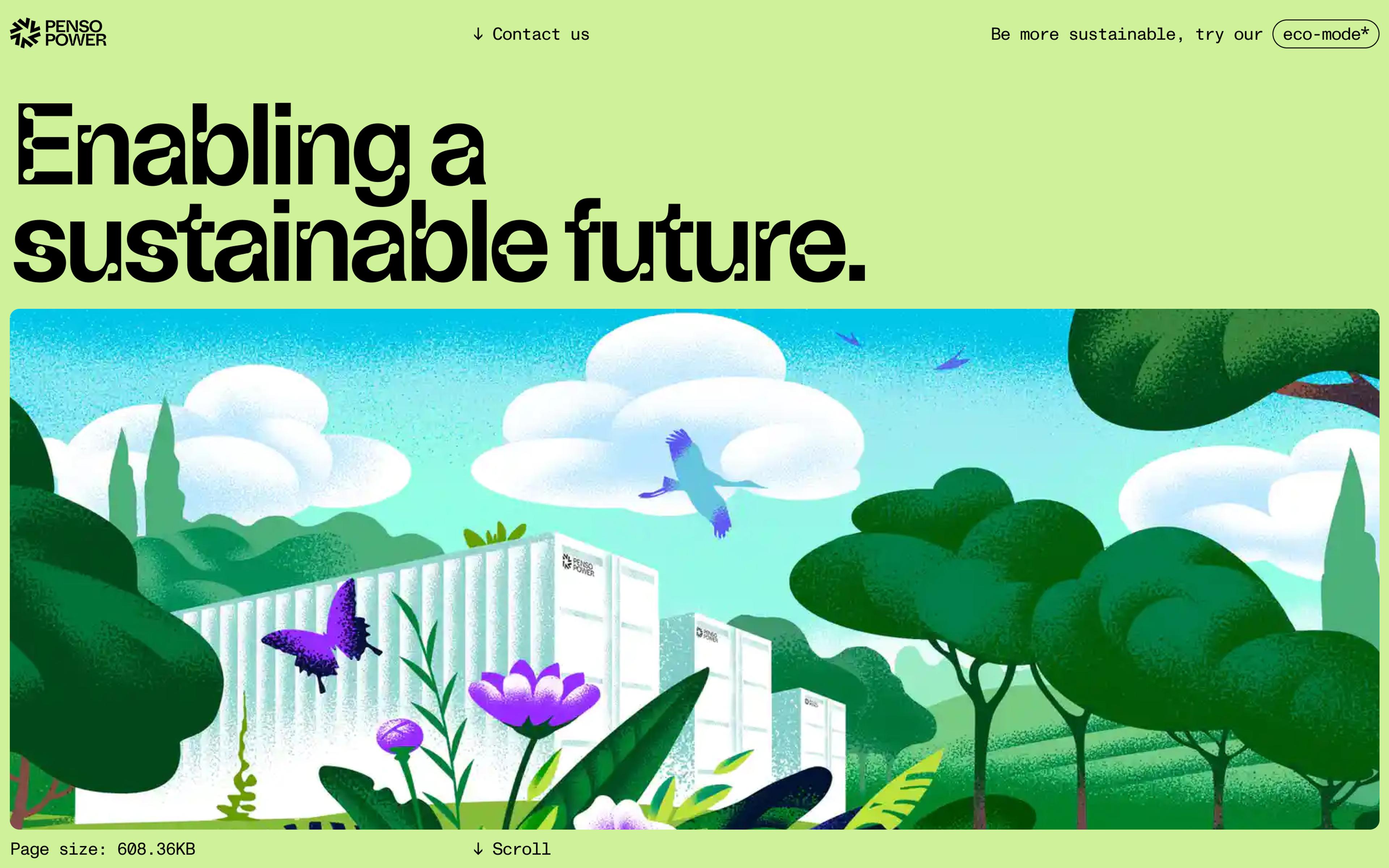
Energy is at the heart of everything we do. But with the current state of the planet, we need to be conscious about using energy the right way.
Penso Power is the leading energy storage provider in the UK. Penso creates, finances and manages projects in renewables and energy storage. Due to the world’s rapidly progressing need for its product, the brand and site needed to evolve for future customers, stakeholders, press and future project investors. Neverbland is a B-corp certified agency, sustainability is at the forefront of our priorities, so we jumped at the opportunity to work on this one.
Sector/Sustainability
Credits/Illustrations/Valentin Tkach
UI Design
Hitting refresh
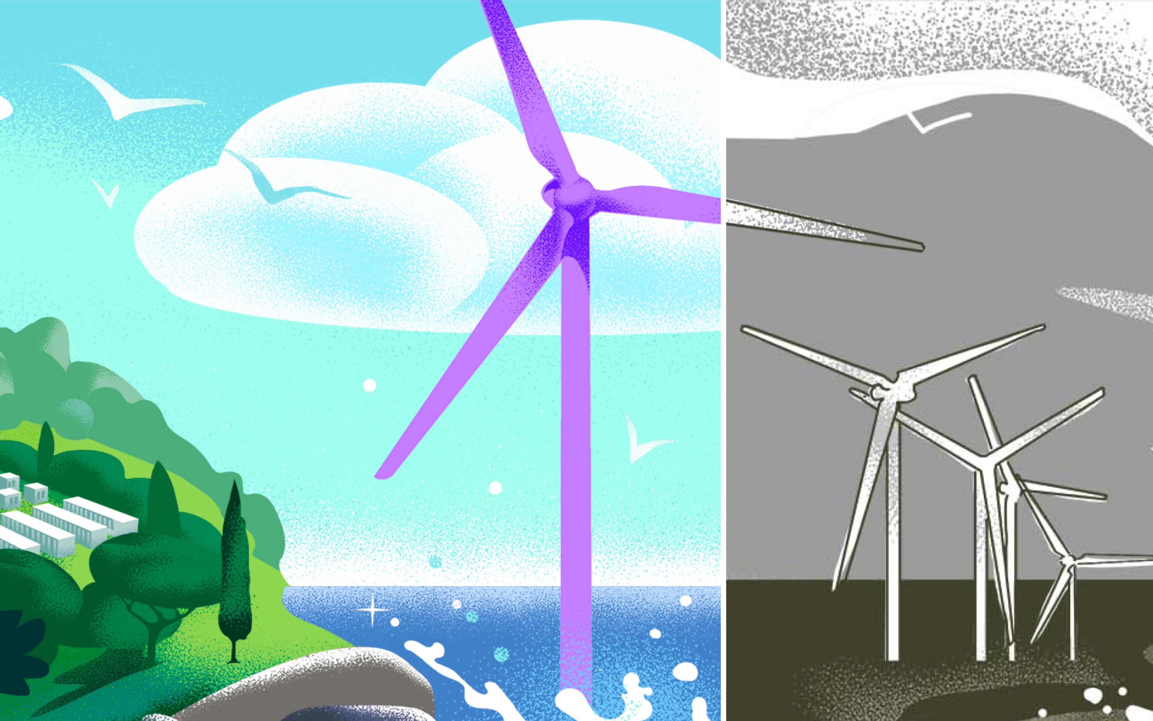
When Penso Power first approached Neverbland they required a simple website update—reformatting their current site as a general update to increase their prominence in the sector. After working closely with Neverbland, the brief evolved into a rebuild of their site and a brand refresh to increase Penso’s credibility.
As Neverbland is a B-corp certified agency, sustainability is at the forefront of our priorities. We’re conscious of our carbon footprint, and it was only fitting that we custom-built a site for Penso that was eco-conscious.
UI Design
Sustainable solutions
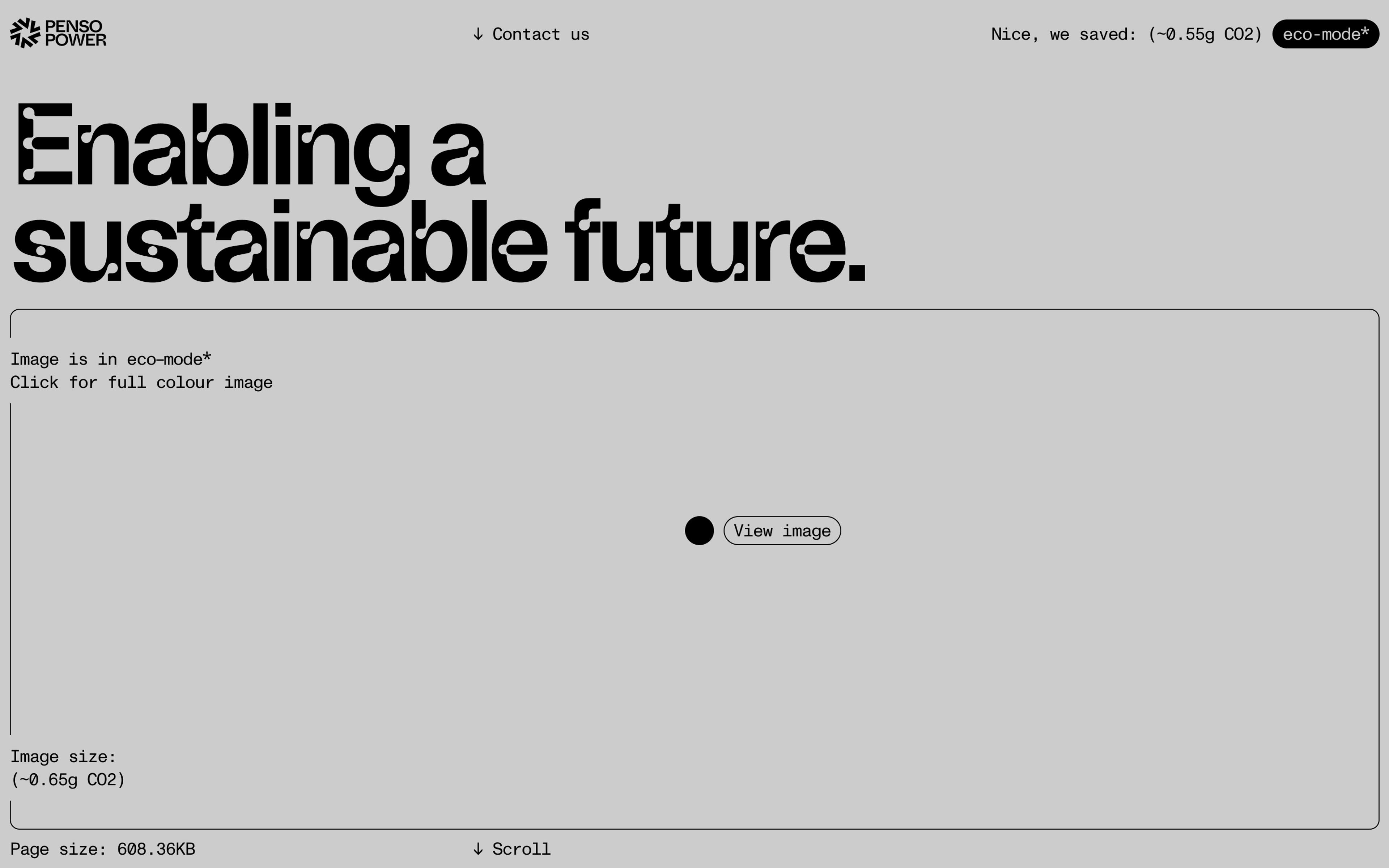
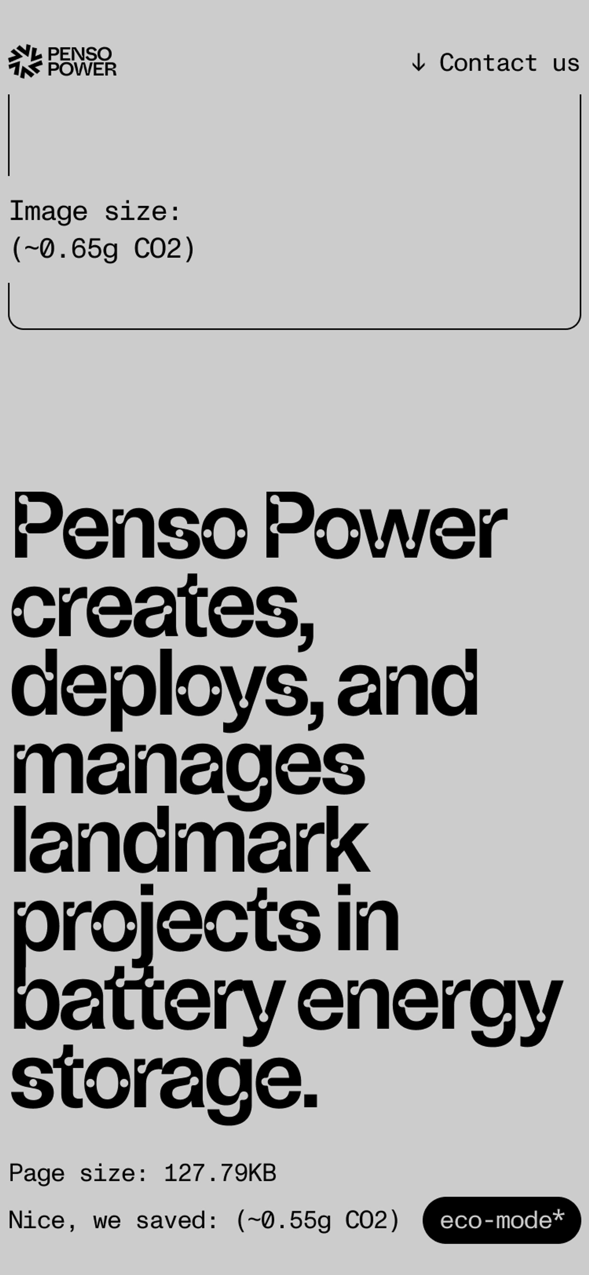
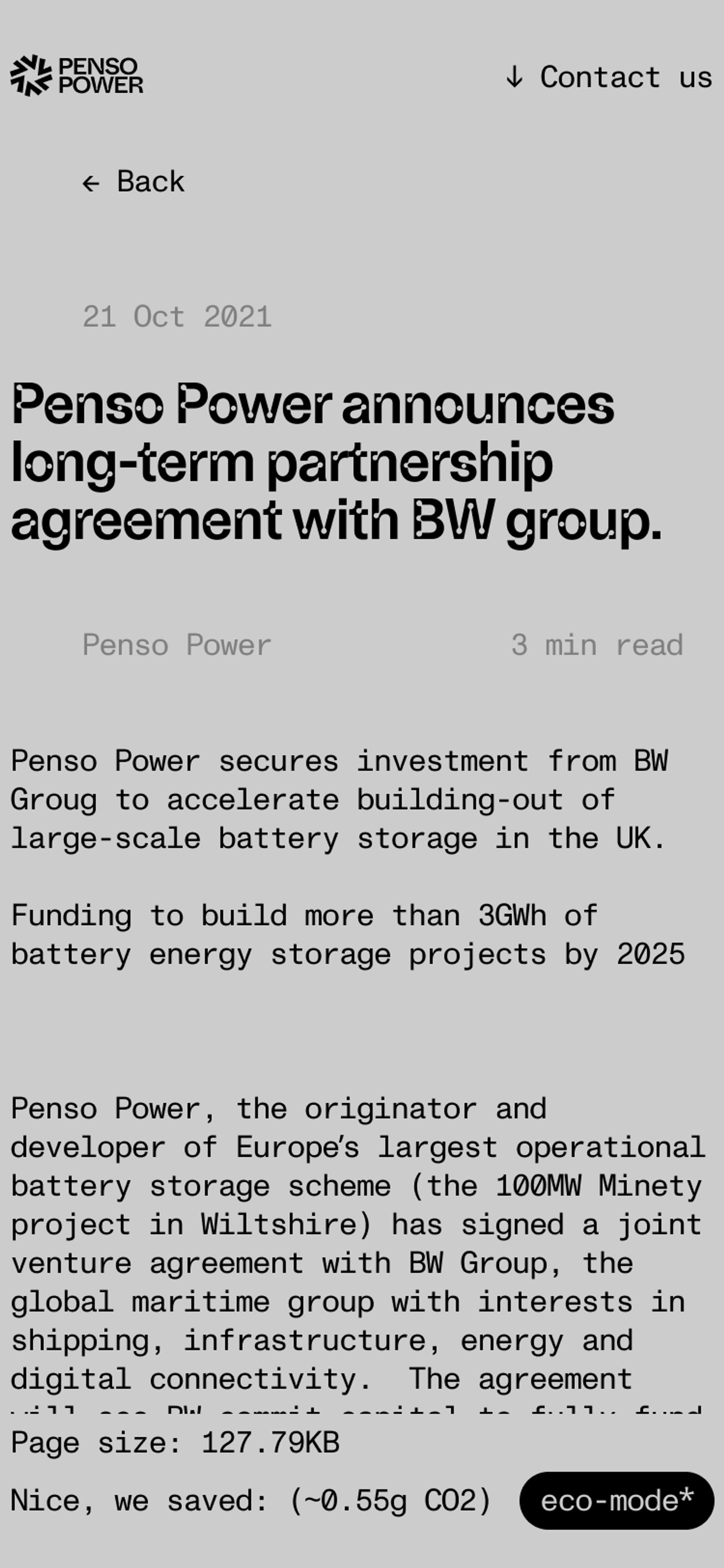
Websites use energy. From high-resolution imagery and autoplay video, a huge amount of data is used and wasted where it could be avoided. We built an eco-mode toggle for the new site to use less data, therefore conserving more energy.
In order to create a cleaner, more sustainable site, we optimised the different media and adopted small size image file formats (AVID and WebP). Images, videos and animations are often the largest media assets on a page. By optimising these files, we can decrease load time and in turn reduce emissions.
To create a site that is lightweight and emission conscious, we stripped the pages of unnecessary weighty scripts. We were meticulous in the building of the site, ensuring there were no unused Javascript and CSS that would take up space and add weight to the page. We also ensured that the total Byte weight of the page was as low as possible.


UI Design
Re-energising the brand identity
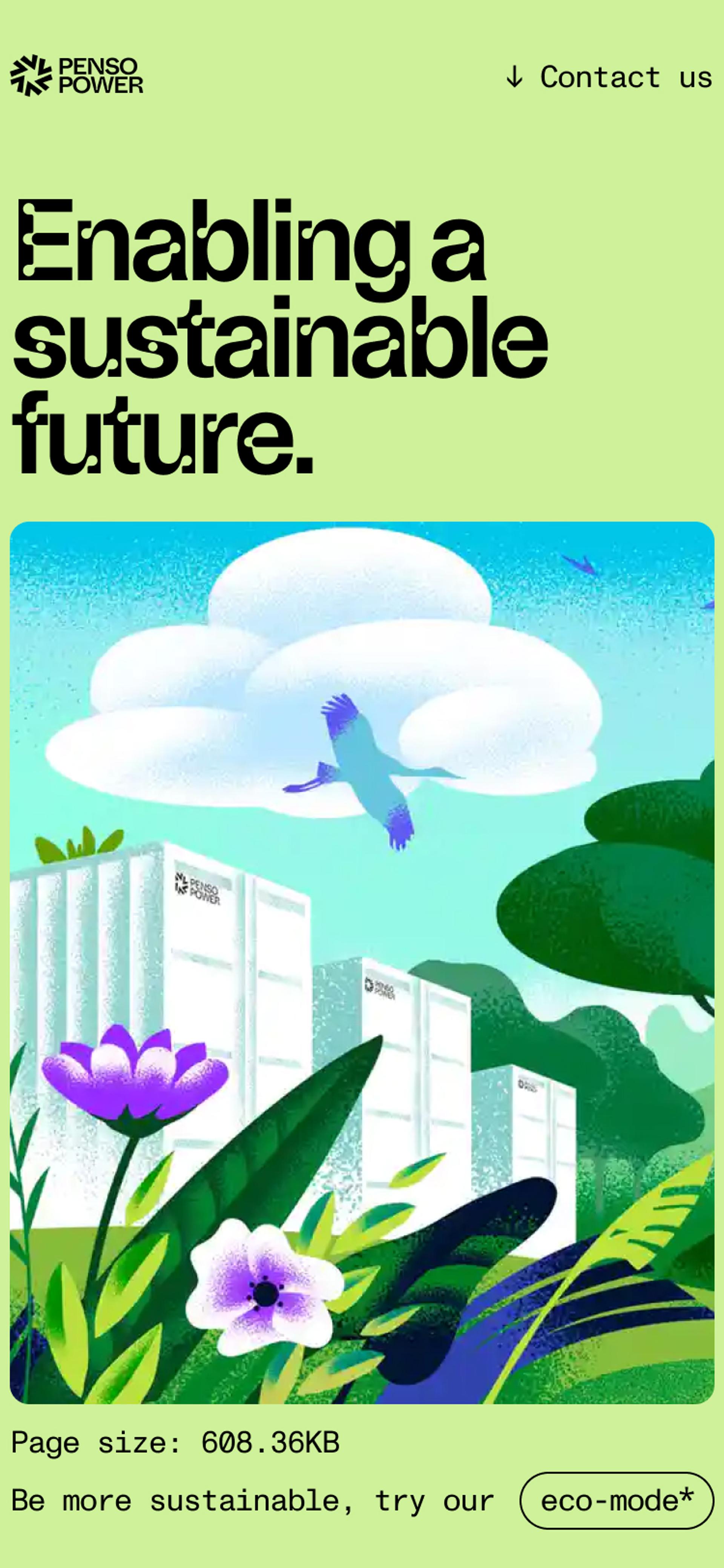
Hitting restart on the brand identity was the starting point of the project. We chose a typeface called ABC Camera. The type is a reinterpretation of light traps, which were originally used in the 60s and 70s to make the text more readable on TV screens.
The aesthetics of the type evoked the feel of modern technology, which was exactly what Penso Power handles and assists through their storage, modern technology that leads to a sustainable future. The type was also the perfect complementary type to pair with the evolved Penso Power logomark.
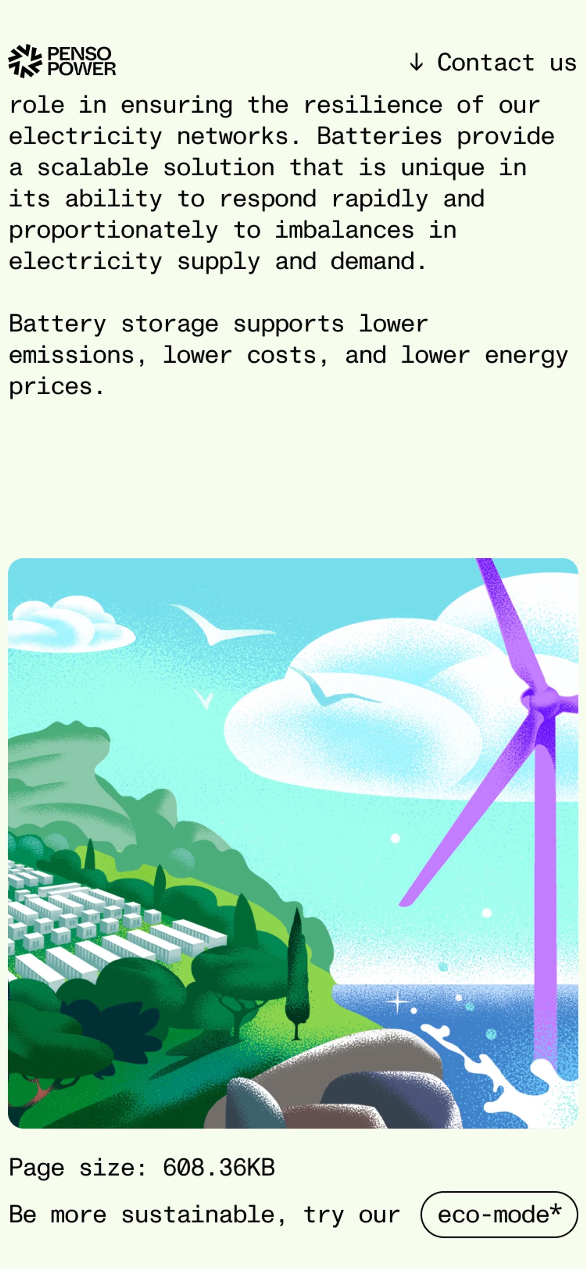
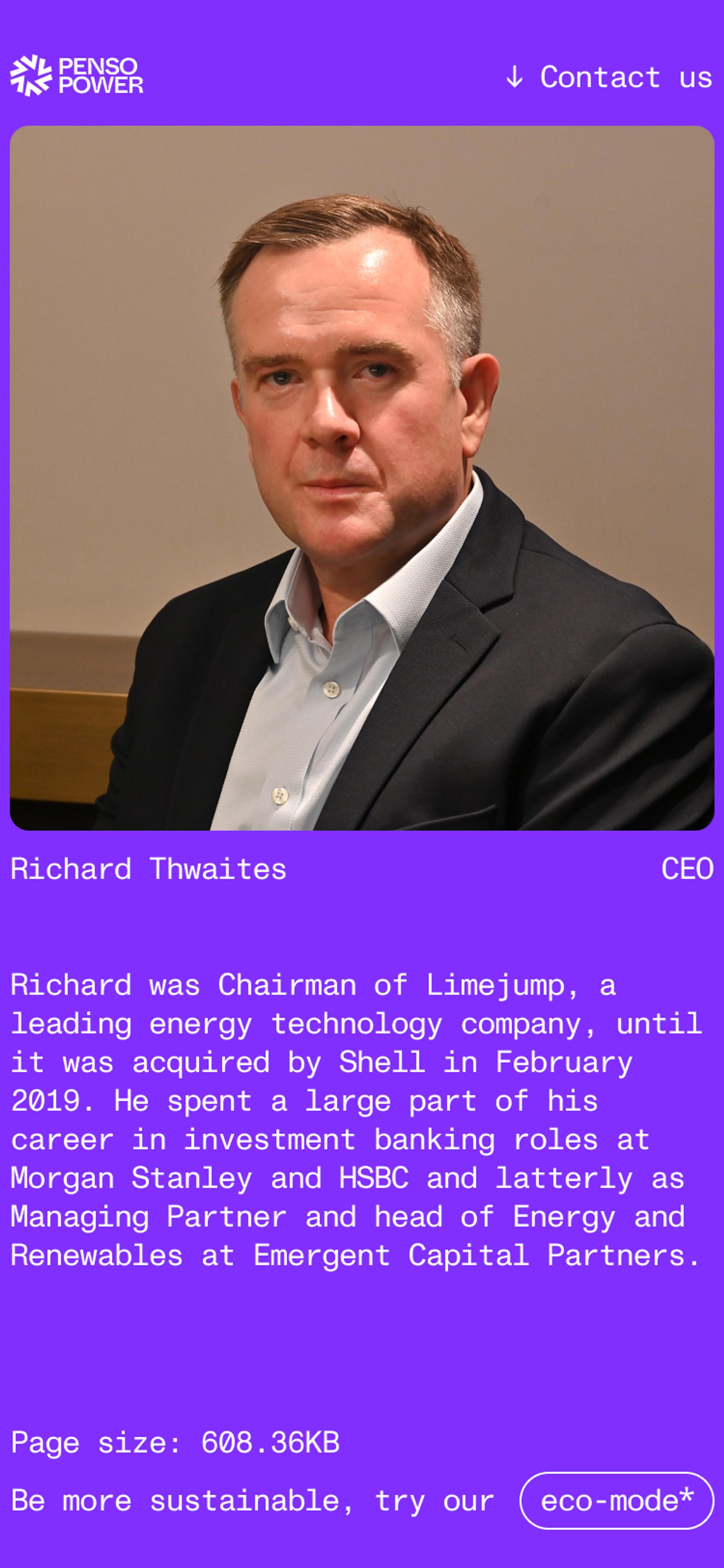
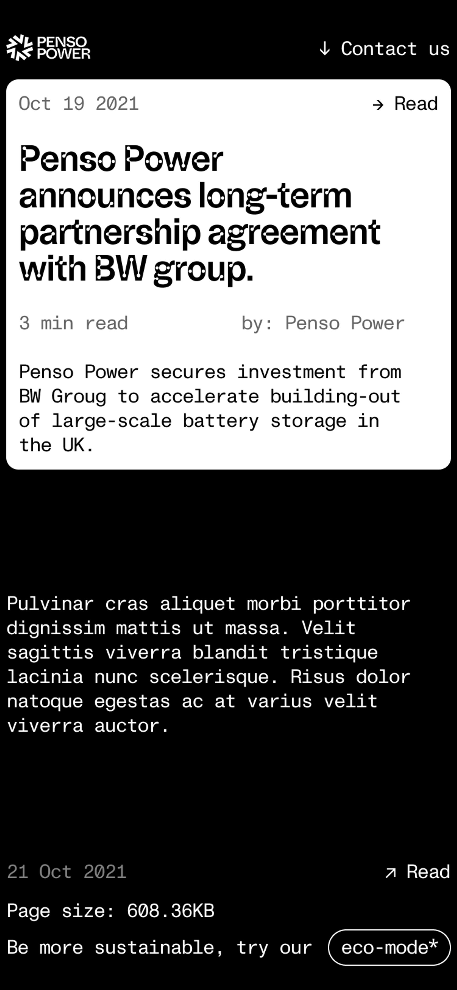
We wanted to avoid using white on the website, as it uses a lot of energy to render the colour. Instead, we introduced green, and a vibrant electric purple to give clean distinctions between the content.
Sustainability
Investing in our future
Now more than ever before, we need to be conscious of the way we use and consume energy. Penso Power is investing in our planet’s future, and now its online presence truly reflects its values. The new website is swift to update, easy to use and engaging to the consumer. The site’s refreshed branding makes Penso feel more culturally relevant, alongside the futuristic product.
When building the site, we examined how sustainable the current site was so we knew what we were up against. Initially, the page resulted in 57% ‘dirtier’ than the pages tested – after our design, the page resulted 86% ‘cleaner’ than the page tested, using websitecarbon.com.
The new site uses just 0.20g of CO2 produced every time someone visits this web page and runs on sustainable energy. In one year, with an average of 10,000 page views per month, pensopower.com will produce 23.46kg of CO2 equivalent. That’s the same amount of CO2 as it would take to make 3,178 cups of tea.
Now, Penso Power has a website that echoes its environmentally conscious ethos, giving them the edge they needed in a competitive market.


