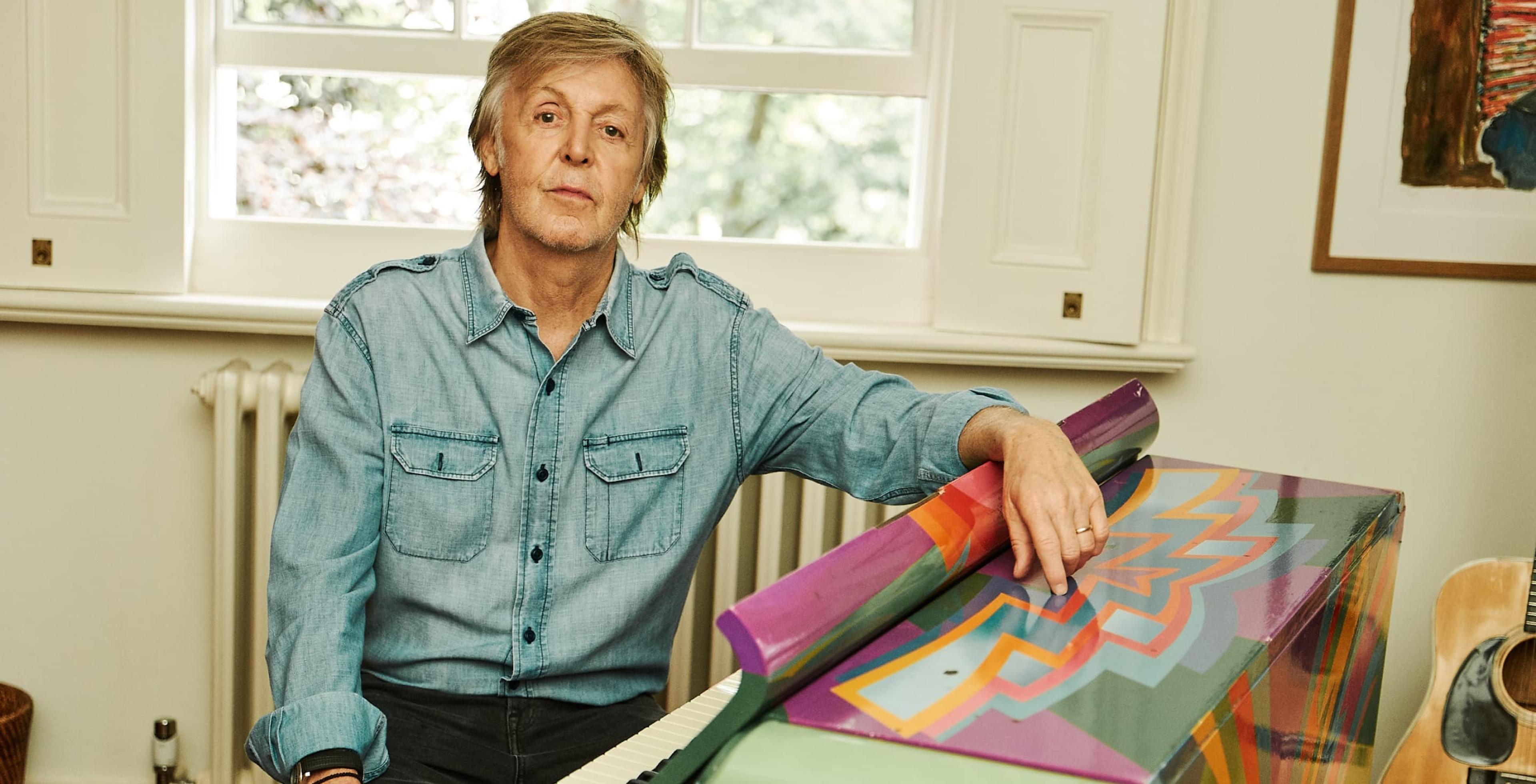
Intro
Rebuilding a superstar's digital identity
Brief
Rock 'n' Roll with extra soul
Sixty years of albums, tours, paintings, handwritten lyrics, archive photography, and personal writing. All of it sitting on a Drupal 7 site that was held together with good intentions and a decade of workarounds.
Paul and his team at MPL wanted something worthy of the archive and the artist. The brief from Paul himself was specific: "dignified, but not corporate; colourful, but classy; a bit rock 'n' roll with extra soul." It also had to be built for the long haul. Easy to manage. Sustainable by design. Flexible enough to keep pace with a man who shows no sign of slowing down.
Sector/Music & entertainment
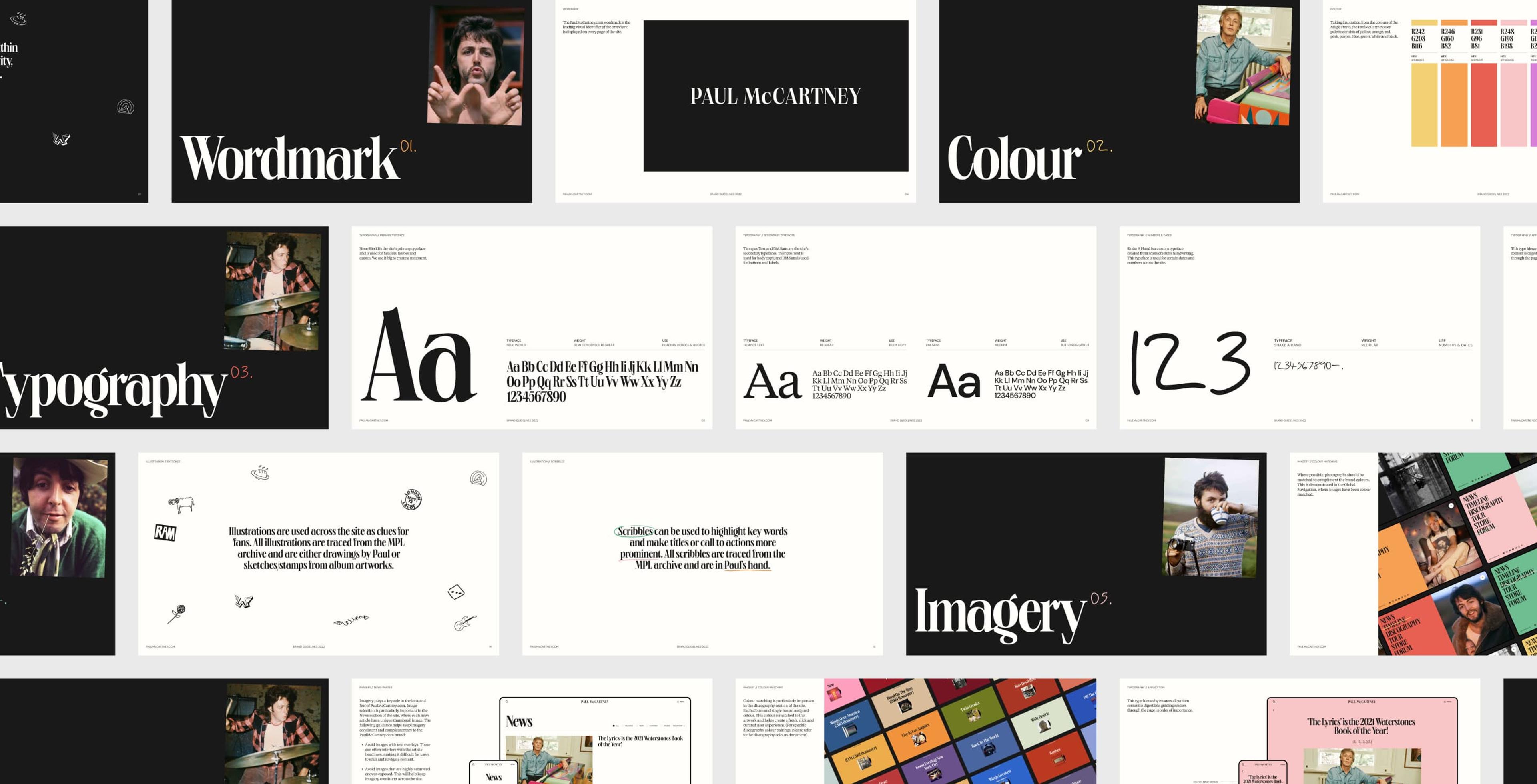
Branding
Content with nowhere to go
This wasn't a website redesign. It was a content governance problem dressed up as one.
3,901 individual items: discography, timeline events, photography, tour archives, and editorial, all spread across a CMS approaching end of life. The site had started as a blog and grown outward without a plan. Content types lived in silos. Fans couldn't explore Paul's career as a connected story. And the CMS was a dead end: it couldn't serve content anywhere beyond the website. No apps. No displays. No future.
The old site also had a sustainability problem. Paul and his team care about environmental impact, and the existing platform was heavy. That needed to change.
Branding
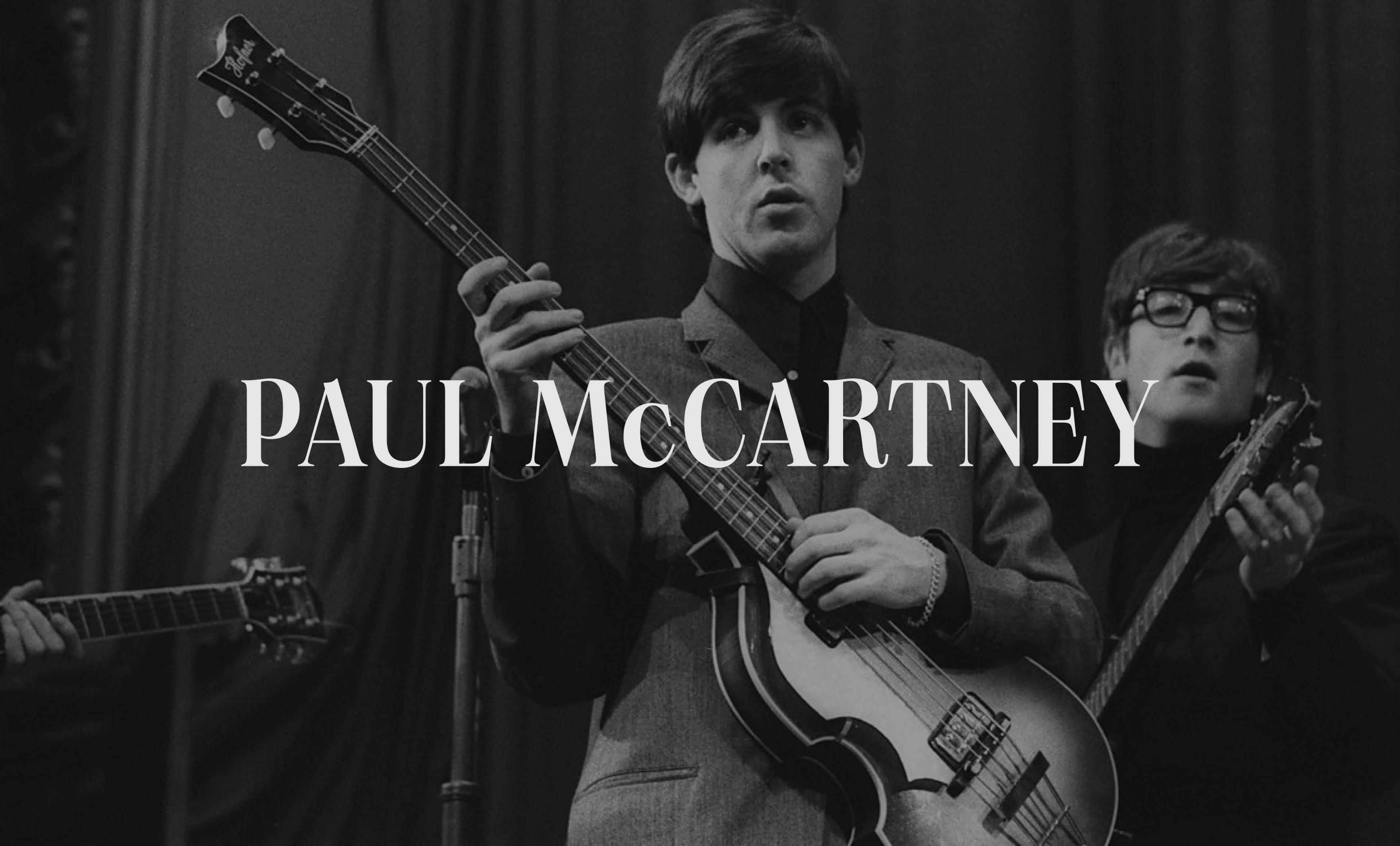
Wordmark
Branding
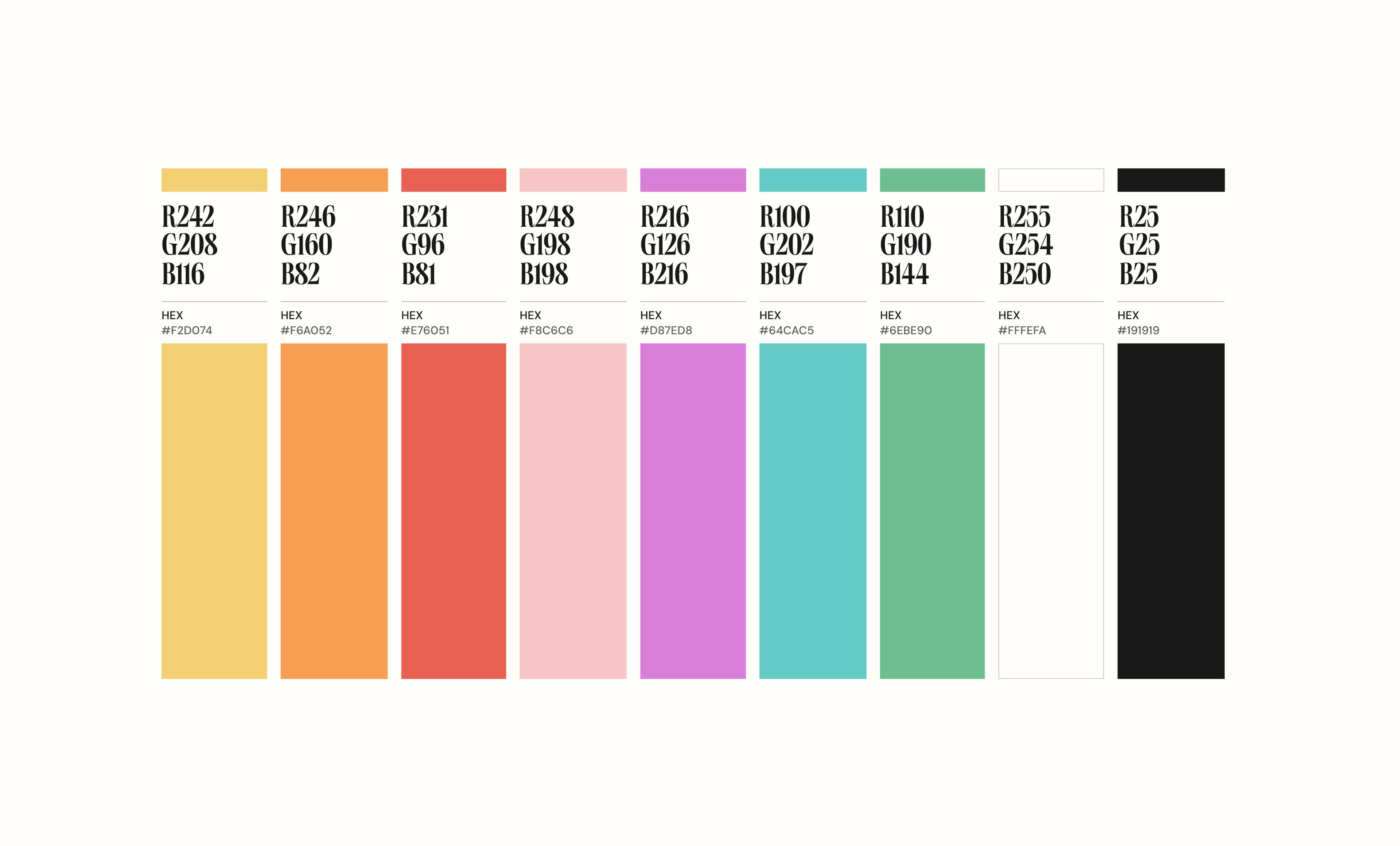
Colour
Branding
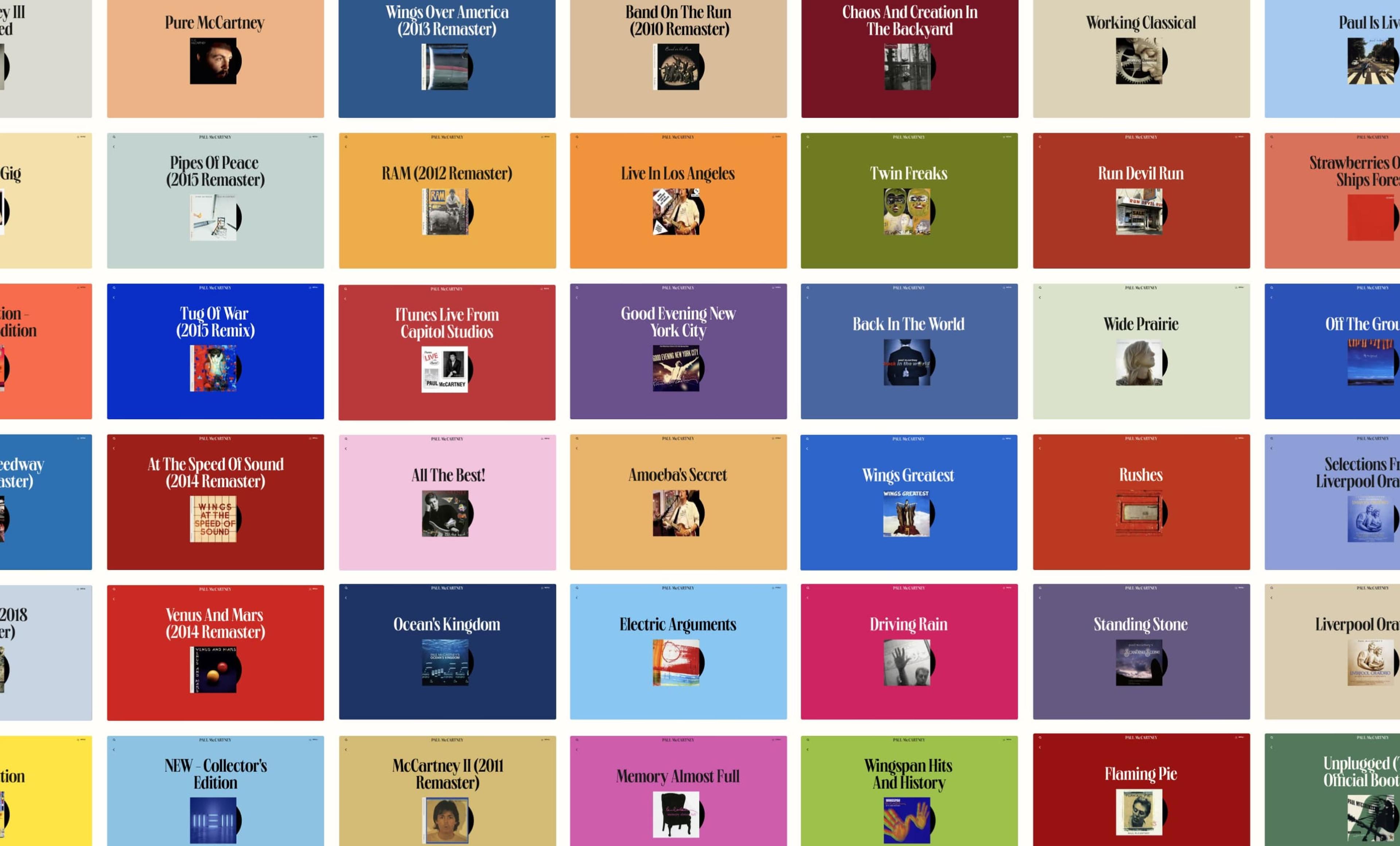
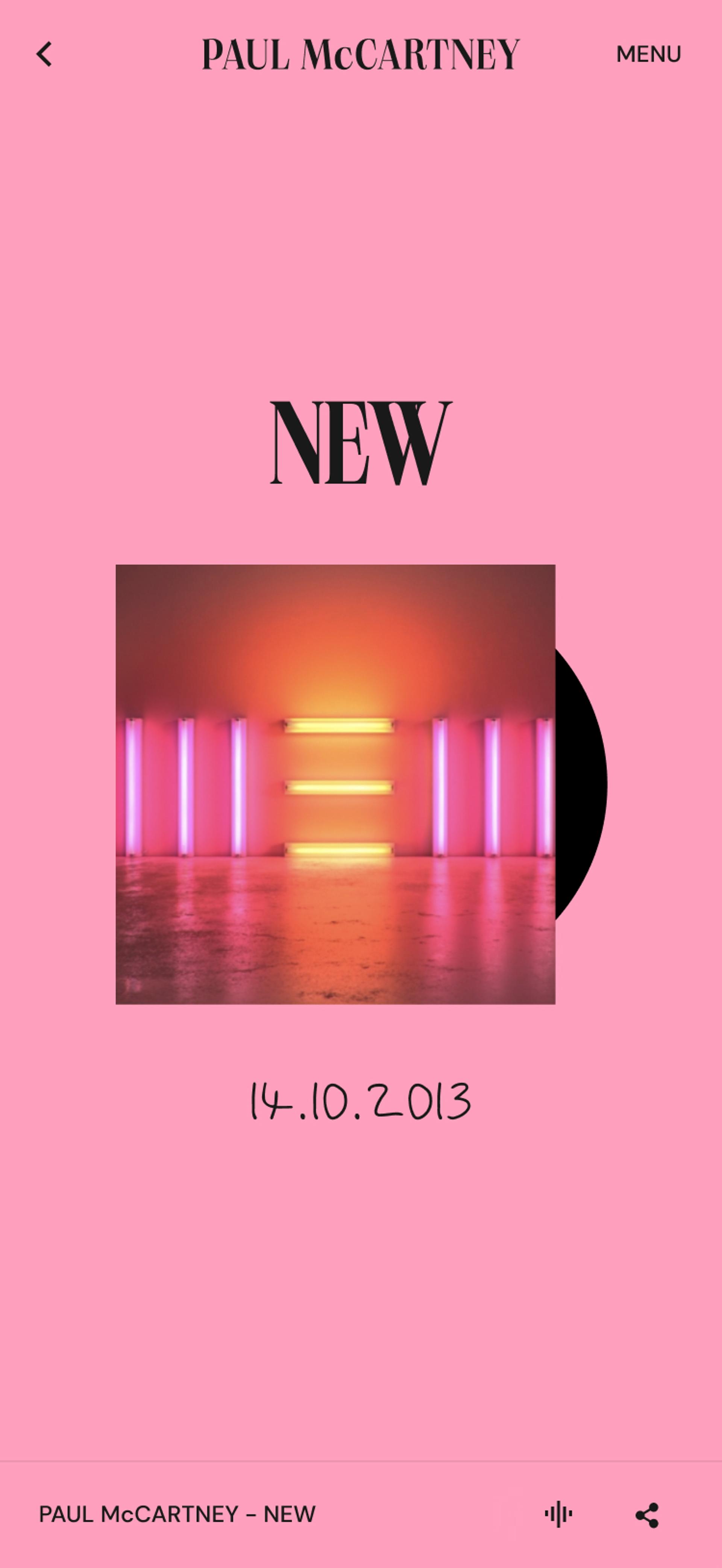
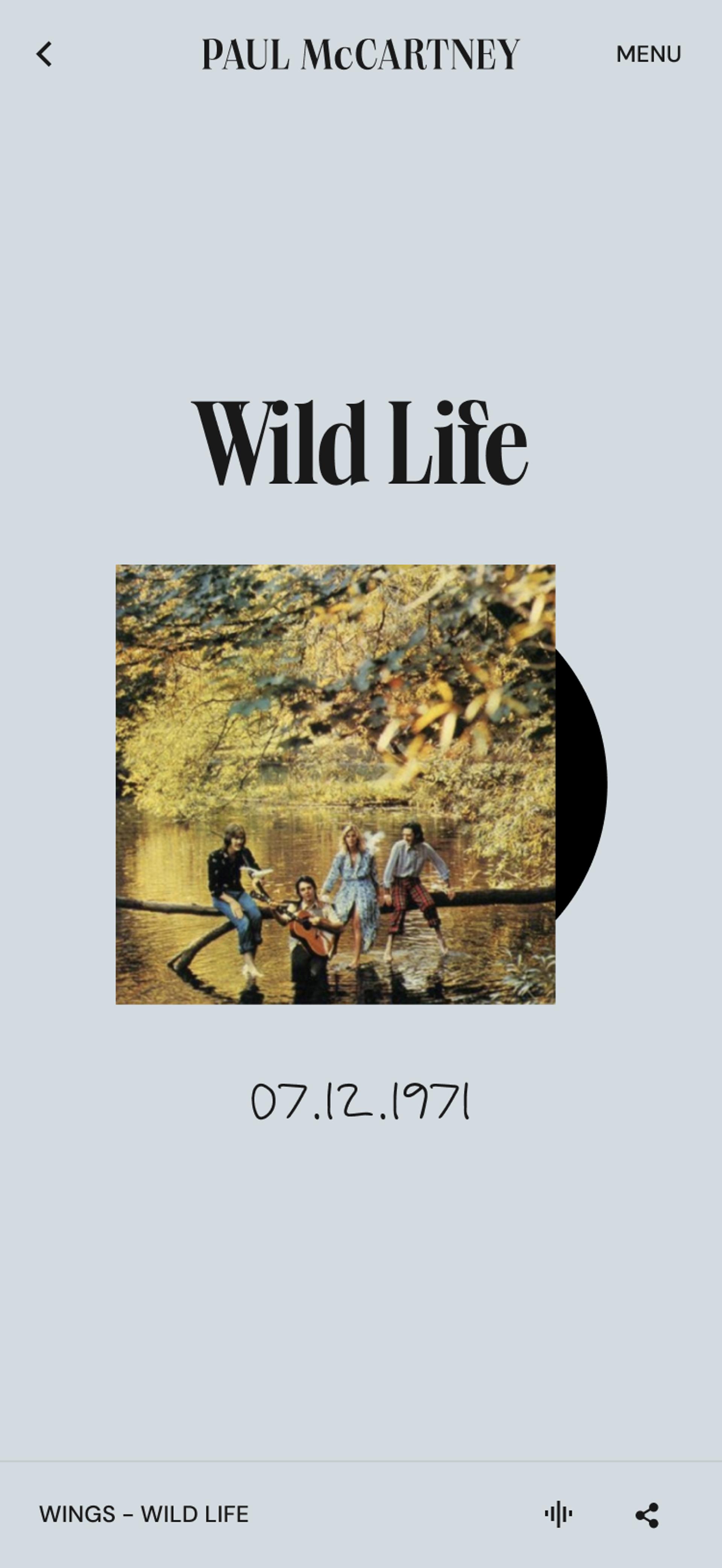
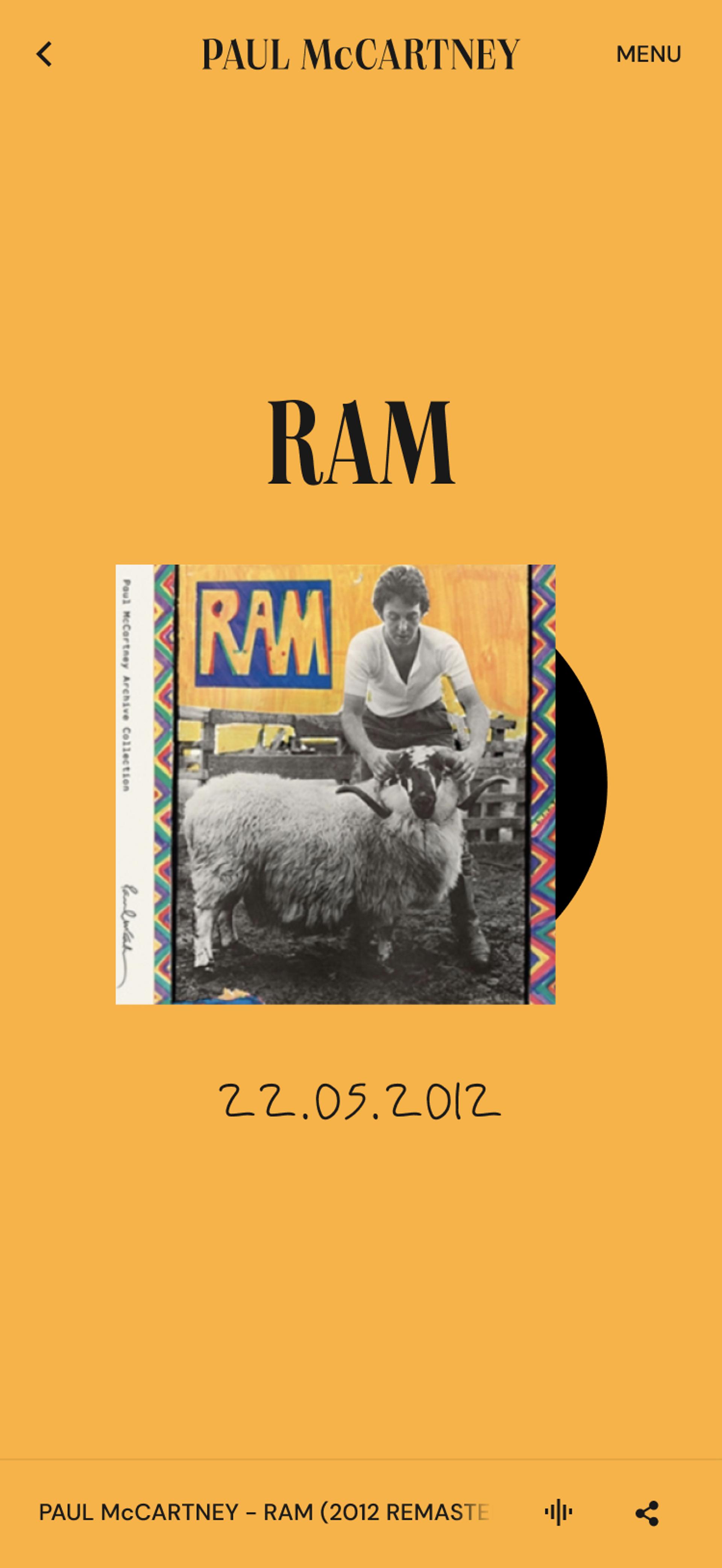
Album colourways
1
2
3
Neverbland's Approach
Magic piano. Headless CMS
Branding
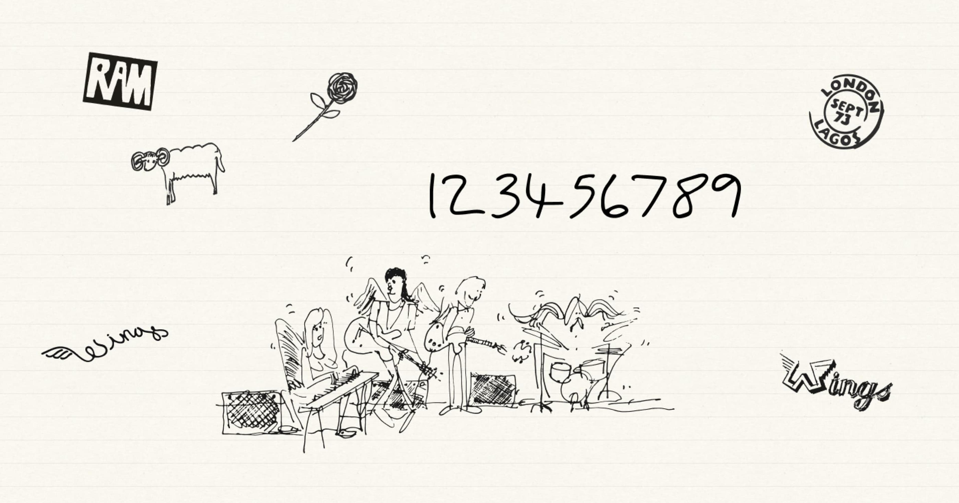
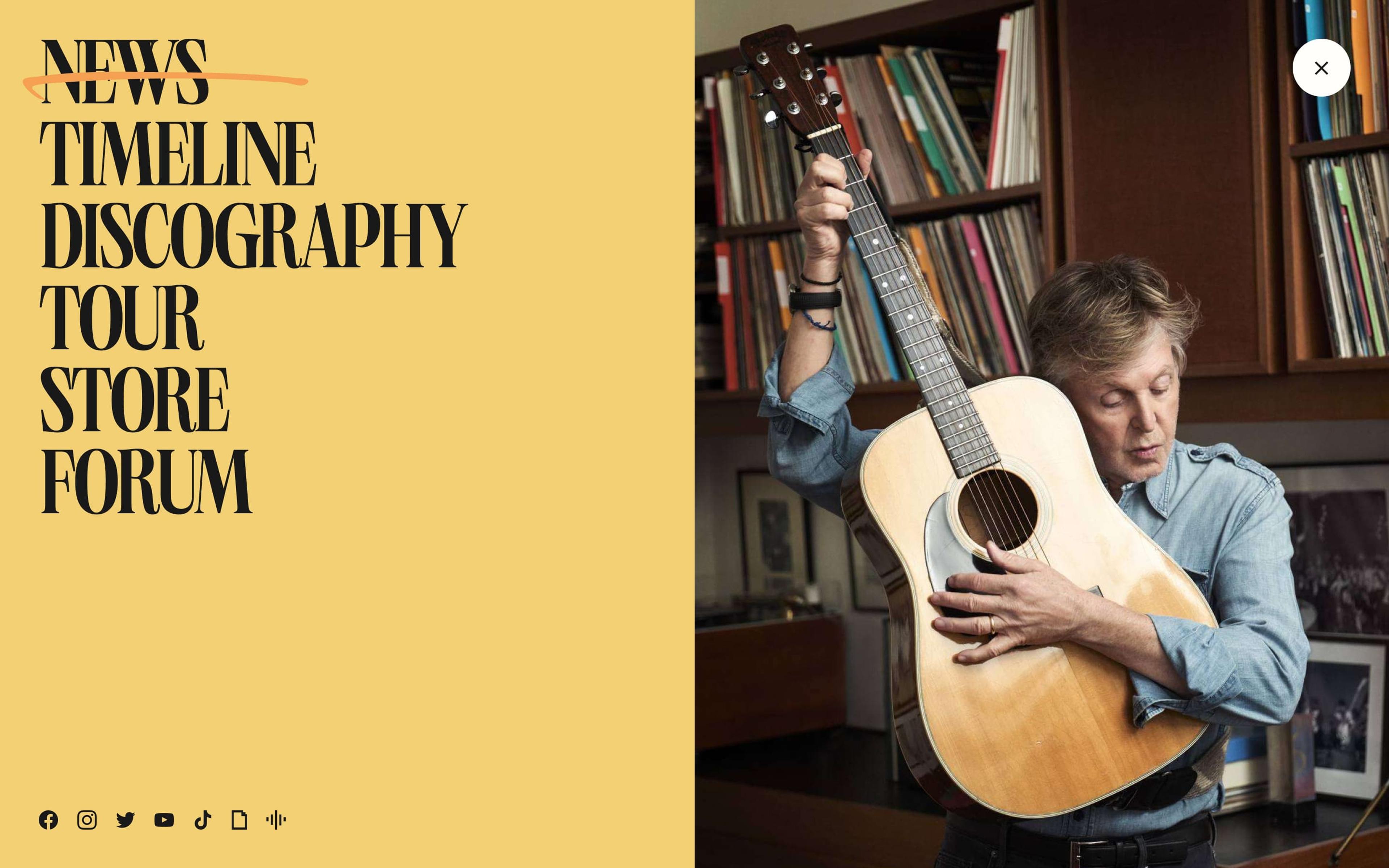
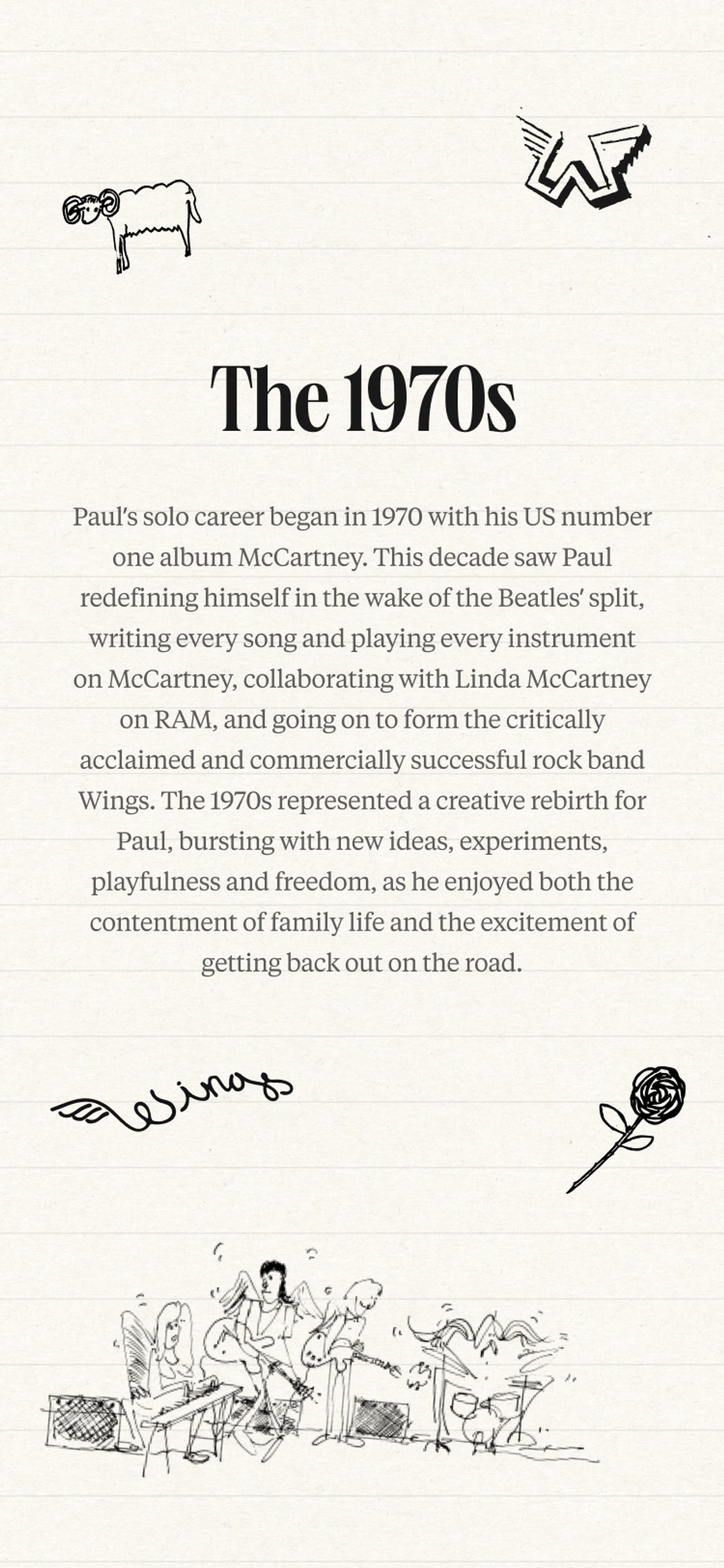
We started where Paul starts with the creative work. The colour palette was lifted from his 'magic piano'. Hand-drawn sketches and doodles were scanned and peppered through the visual language. We paired Neue World Condensed headlines with DM Sans and Tiempos Text body copy – classic enough for the fanbase and modern enough for the next decade.
From scans of Paul's own writing, we built a bespoke numerical typeface called 'Shake a Hand', named after one of his tracks for dates and timeline navigation. His actual handwriting, turned into a design system.
UX Design
From content sprawl to canon
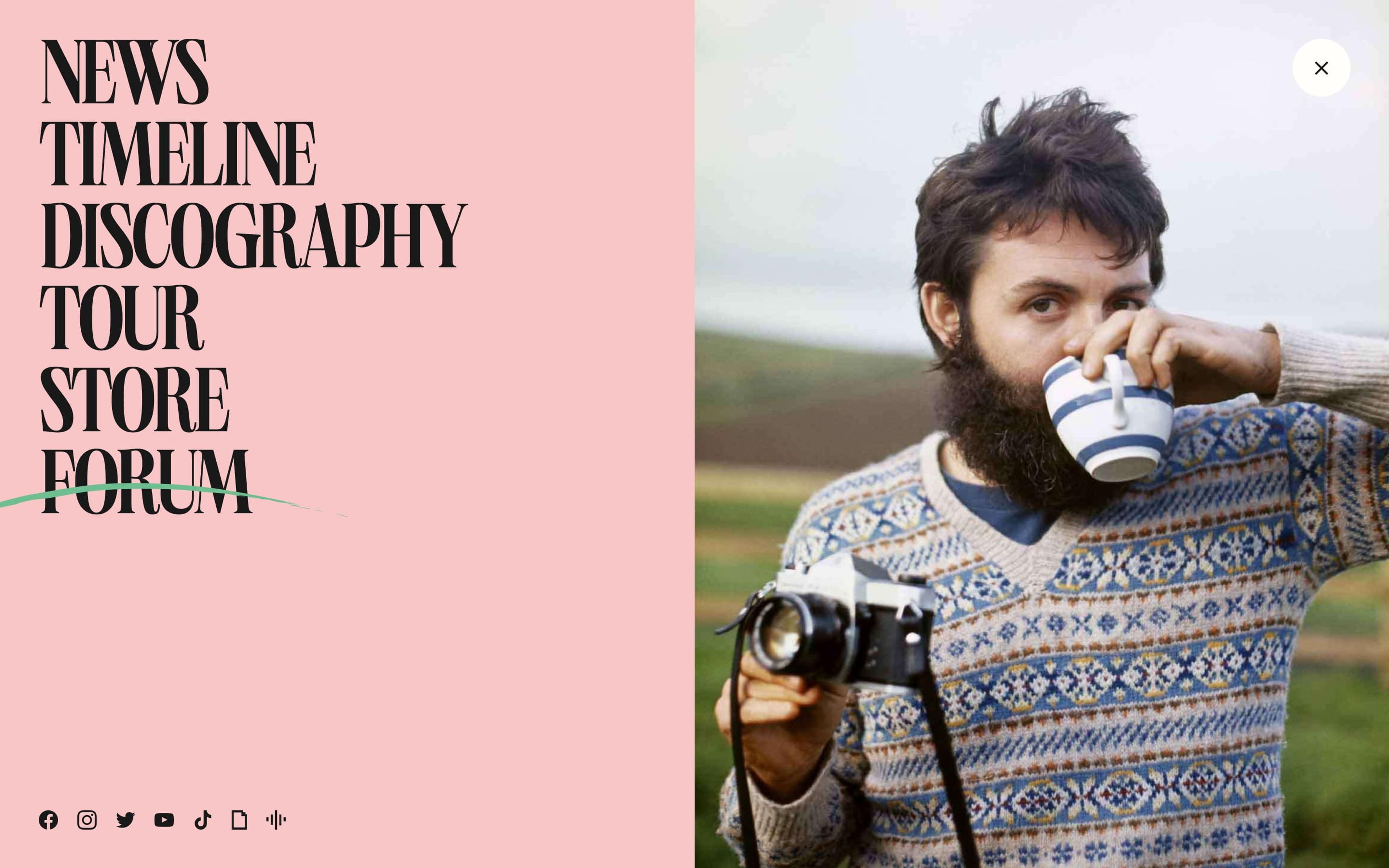
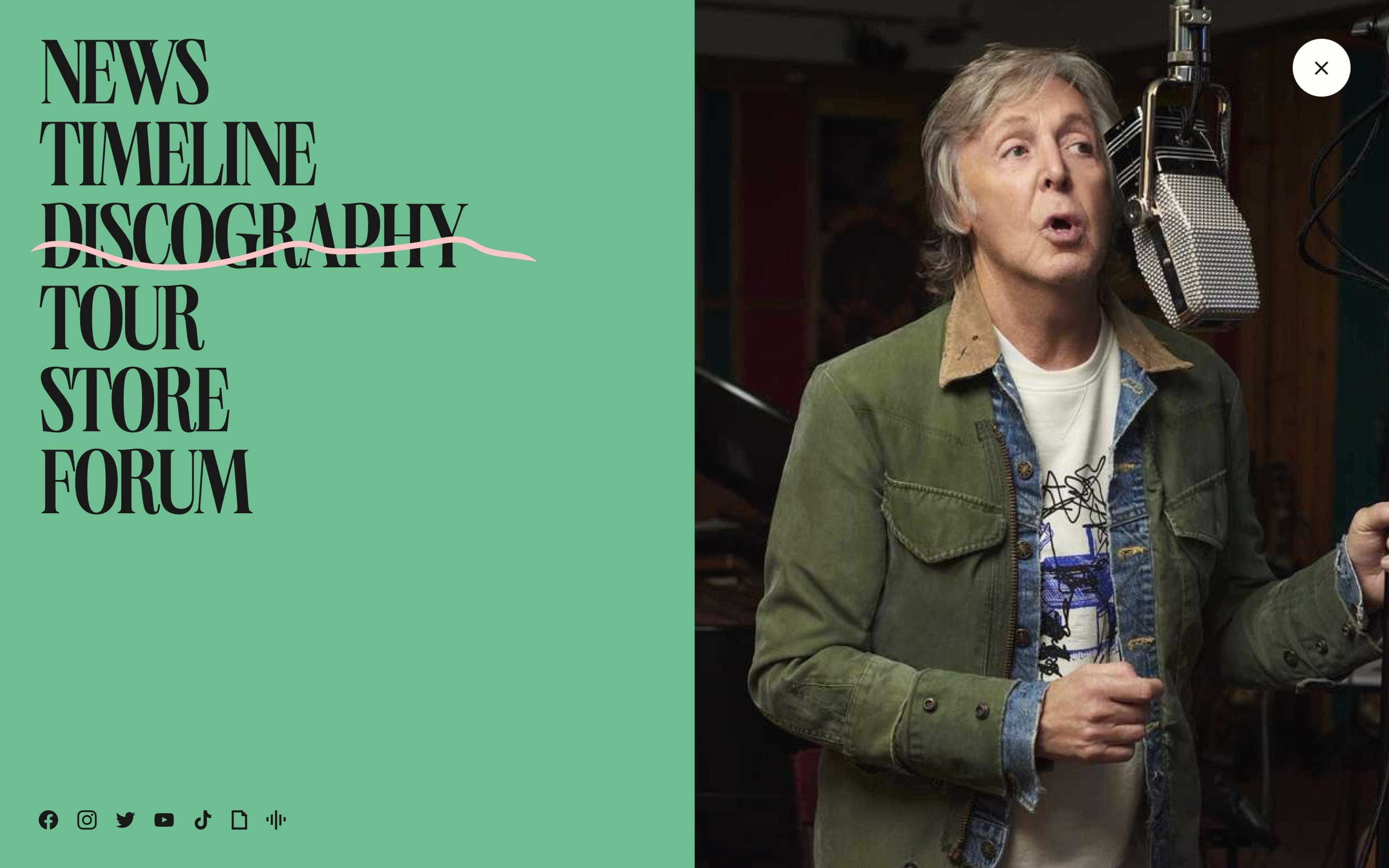
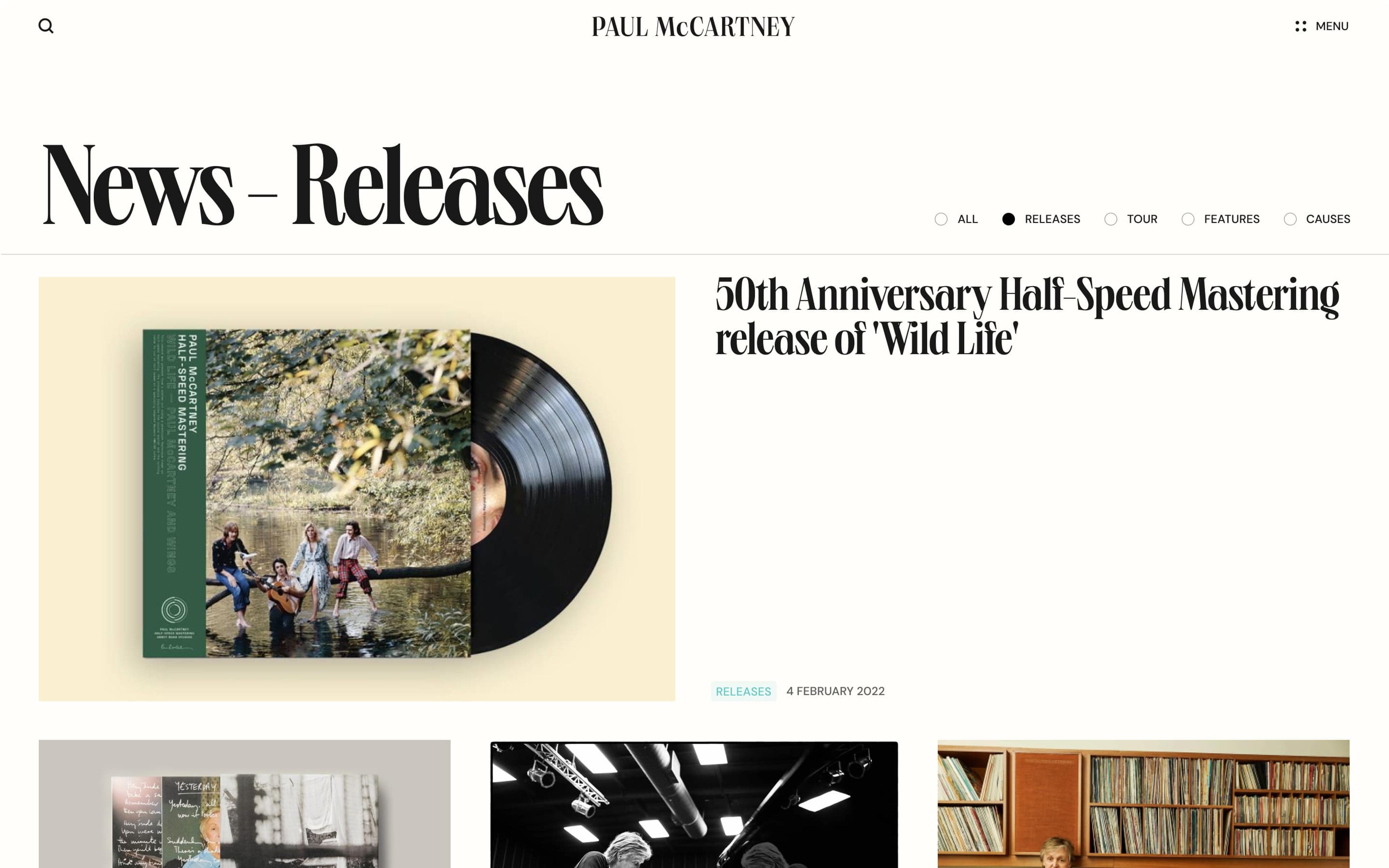
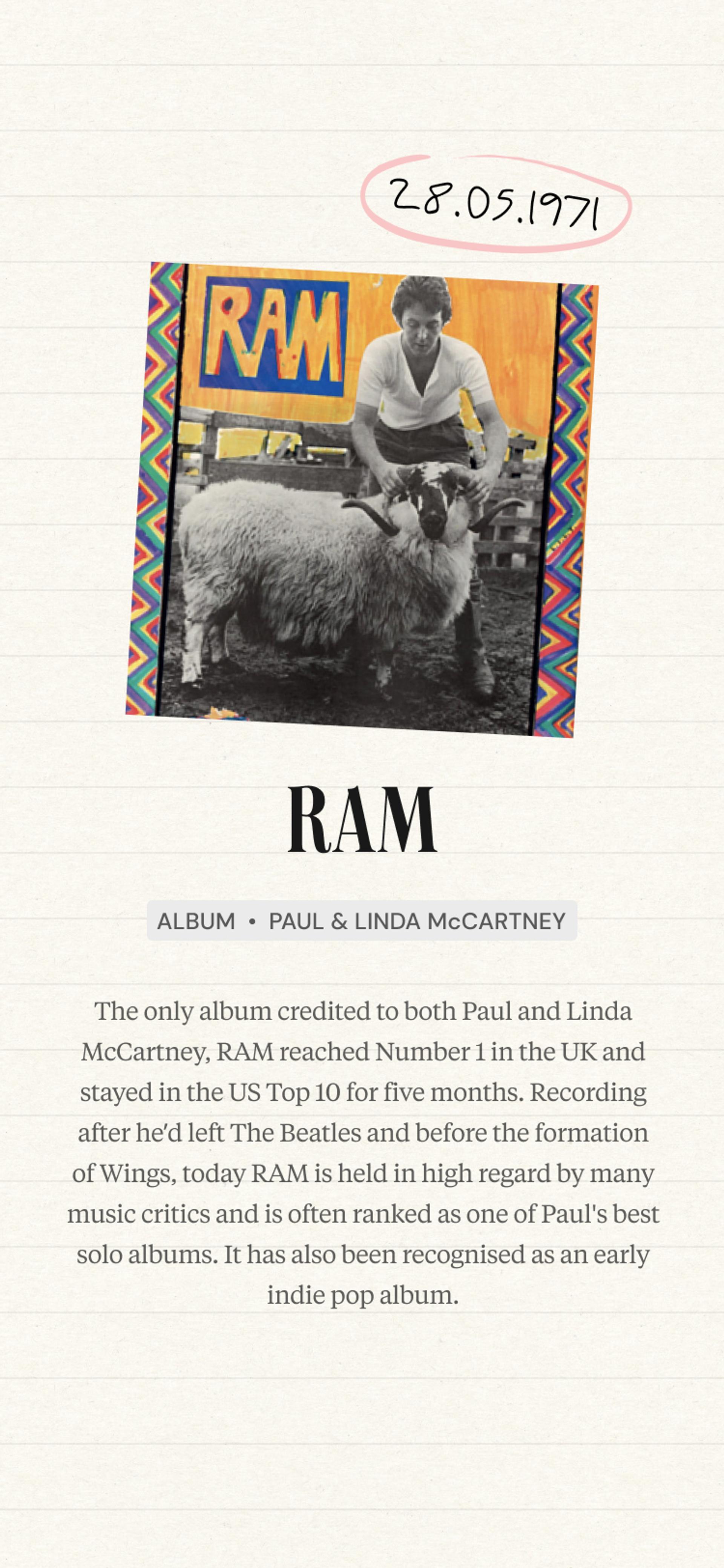
We restructured the entire archive into a connected, explorable experience. Discography, timeline, photography, and editorial link to each other naturally. The site went from a bloated blog to something that feels like a narrative with different sections talking to each other rather than sitting in silos.
UI Design
Every milestone. One timeline
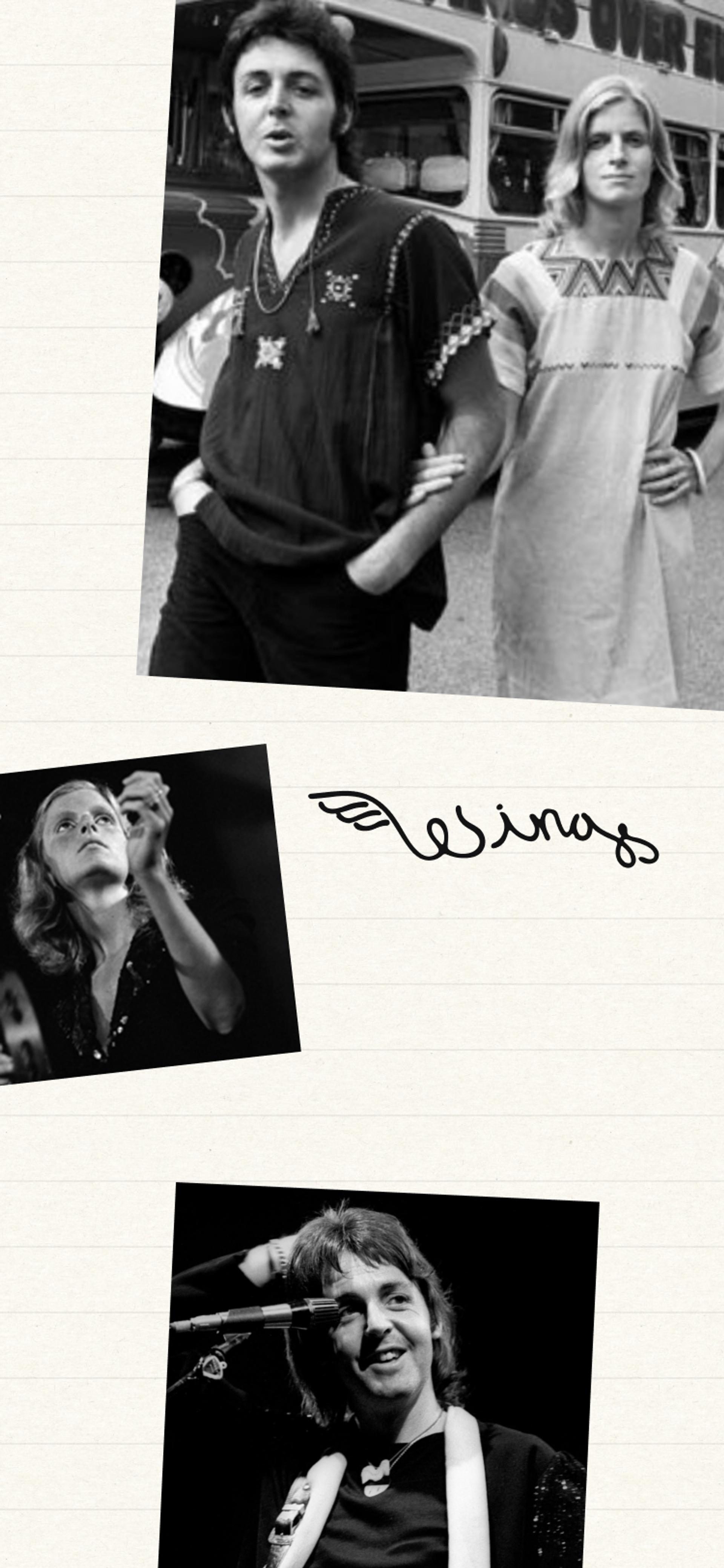
The centrepiece: an interactive timeline housing every significant moment since the 1970s gigs, releases, knighthoods, and books all populated automatically from the CMS. Publish a piece of content anywhere on the site, and it appears in the timeline without anyone lifting a finger.
UI Design
One album. One colour
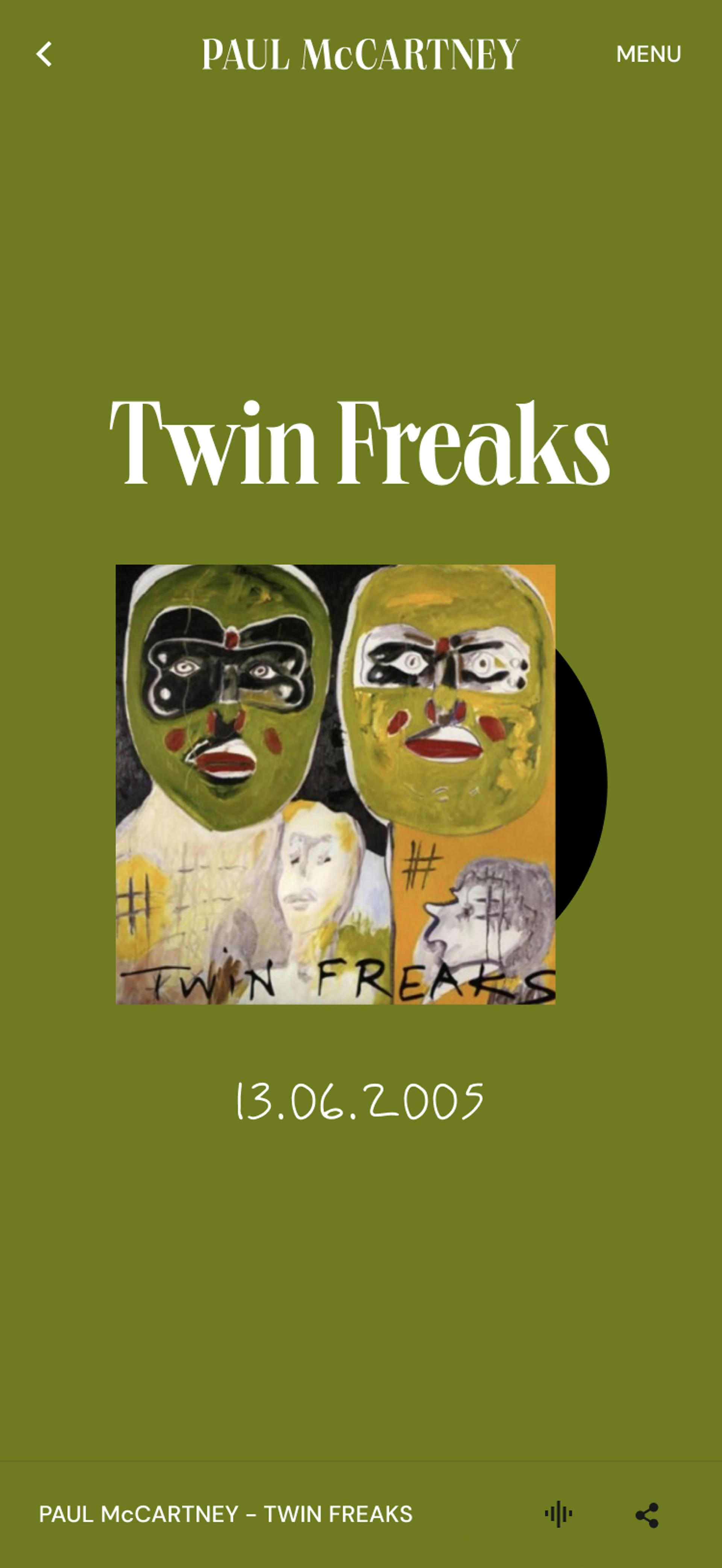
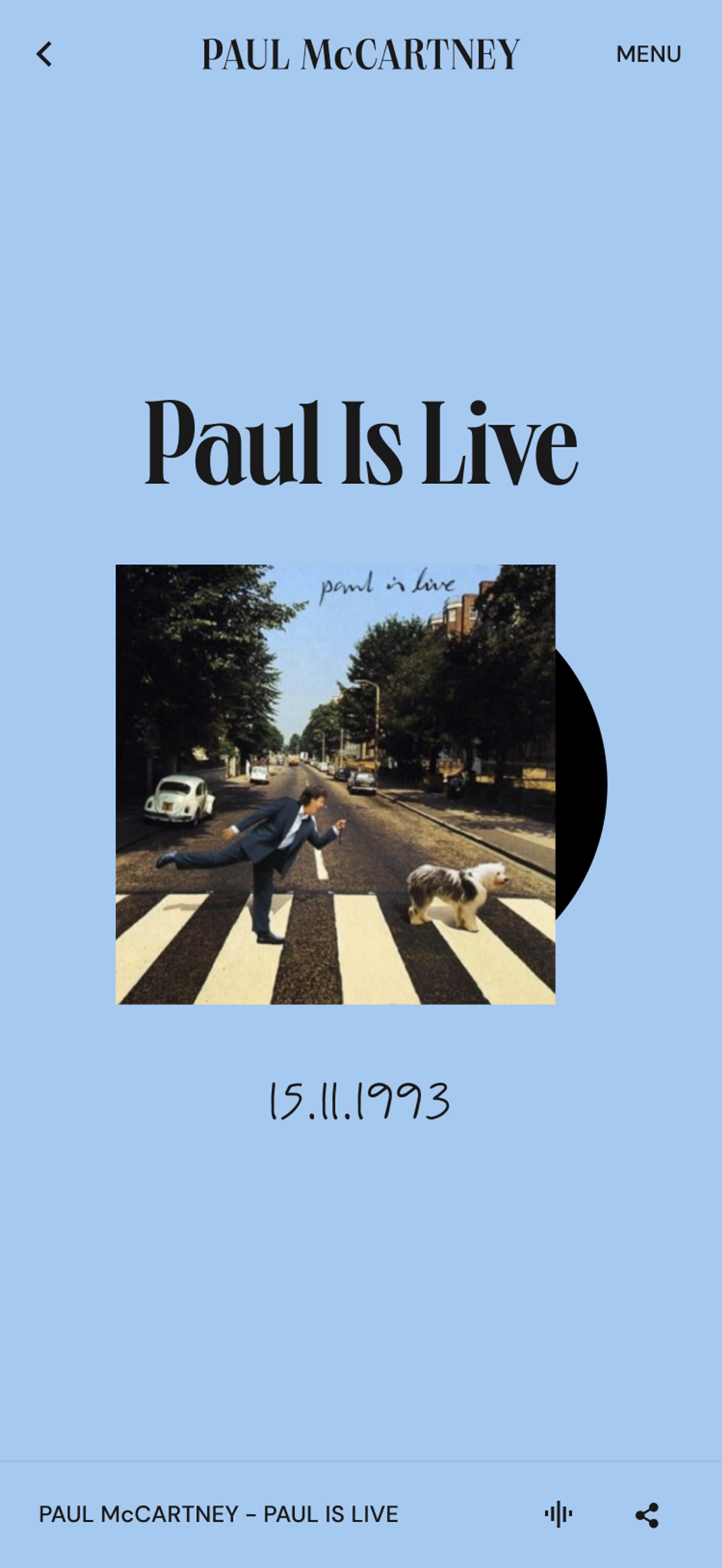
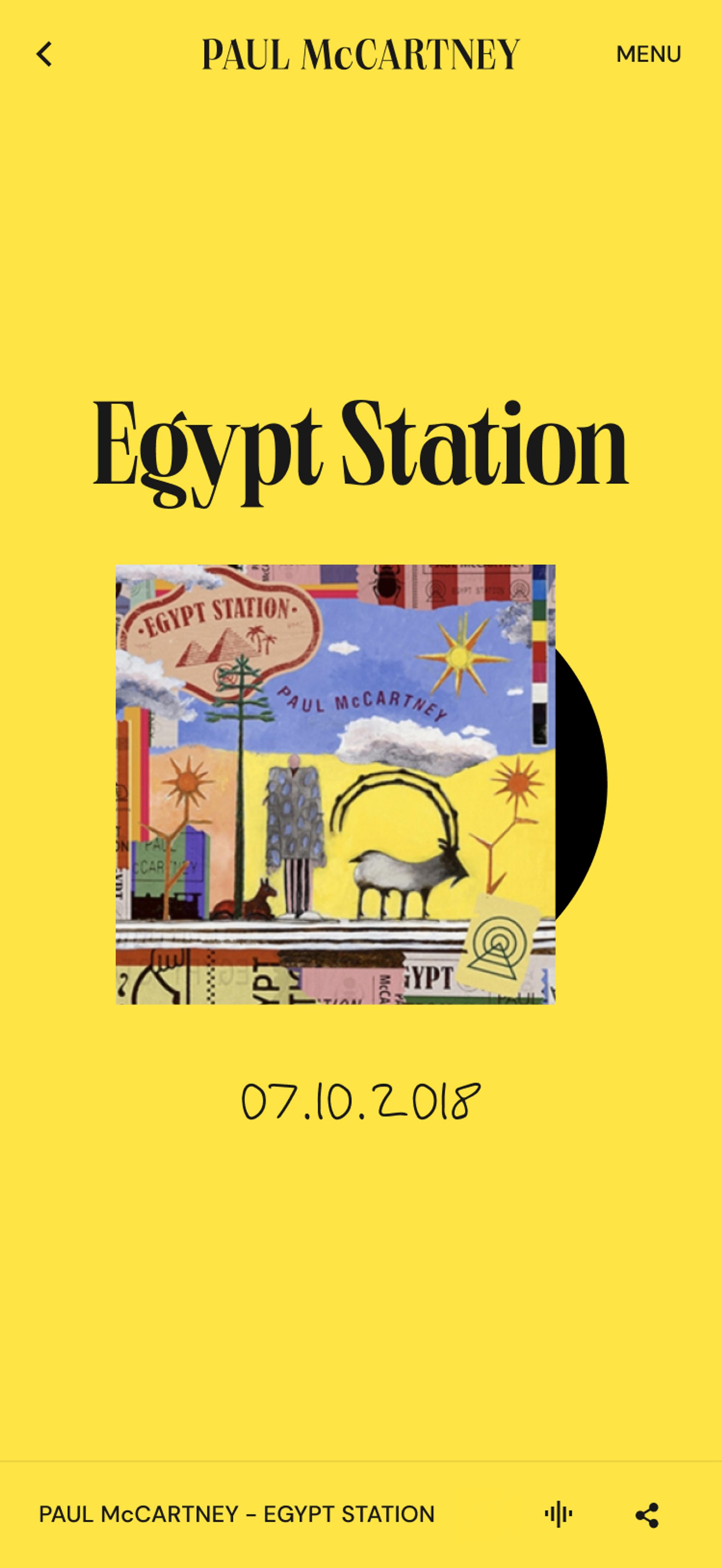
Every release in Paul's discography got its own unique HEX colour code derived from its artwork. Discovery, not a list.
Technology
Long live the headless CMS
Hygraph (formerly GraphCMS) gave us a headless architecture using GraphQL; the same content can serve the website, future apps, and digital displays from one source of truth. GraphQL also lets us be surgically selective about what data hits each page. Lighter payloads. Faster loads. Lower emissions. The front end runs on Next.js, hosted on Vercel.
We implemented AccessiBe for ADA and WCAG compliance because the audience for this site is everyone. And carbon reduction wasn't a nice-to-have. It was a design necessity. Optimised media, selective data fetching, and efficient hosting meant estimated emissions dropped from 811 kg to 119 kg CO₂ per 10,000 page visits. An estimated 85% reduction.
The Outcome
Four years. Still shipping.
The site launched on 18 May 2022. Three weeks later it picked up an Awwwards Honourable Mention. The typography system became a Fonts In Use staff pick. Vercel featured it in their Experts showcase. Nice.
More importantly, four years later, we're still here. Building album landing pages for new releases. Supporting music launches. Iterating on the CMS as Paul keeps creating. The timeline launched in beta and has expanded steadily since. Every new piece of content populates it automatically. The archive grows itself.
The MPL team called the site "such a useful tool for us" and praised the team for building at speed with imperfect information, which in reality is every project.
Key numbers:
→ 3,901 content items migrated
→ ~85% estimated reduction in carbon emissions per visit
→ Awwwards Honorable Mention (June 2022)
→ Custom typeface created from Paul's handwriting
→ 4+ year ongoing partnership
→ Featured on Fonts In Use (staff pick), Pangram Pangram, and Vercel Experts
Over to you
Sound familiar?
You've got years of content. Maybe decades. It lives across systems that don't talk to each other, managed by a CMS that's older than some of your team. The archive is valuable, but nobody can find anything in it.
This project is our proof that you can rebuild the whole thing – brand, architecture, technology, and governance – without losing what makes it special. And that the right partnership doesn't end at launch. It gets better after it.