Togetherall
Intro
Supercharging the world’s leading mental health platform for future growth
Brief
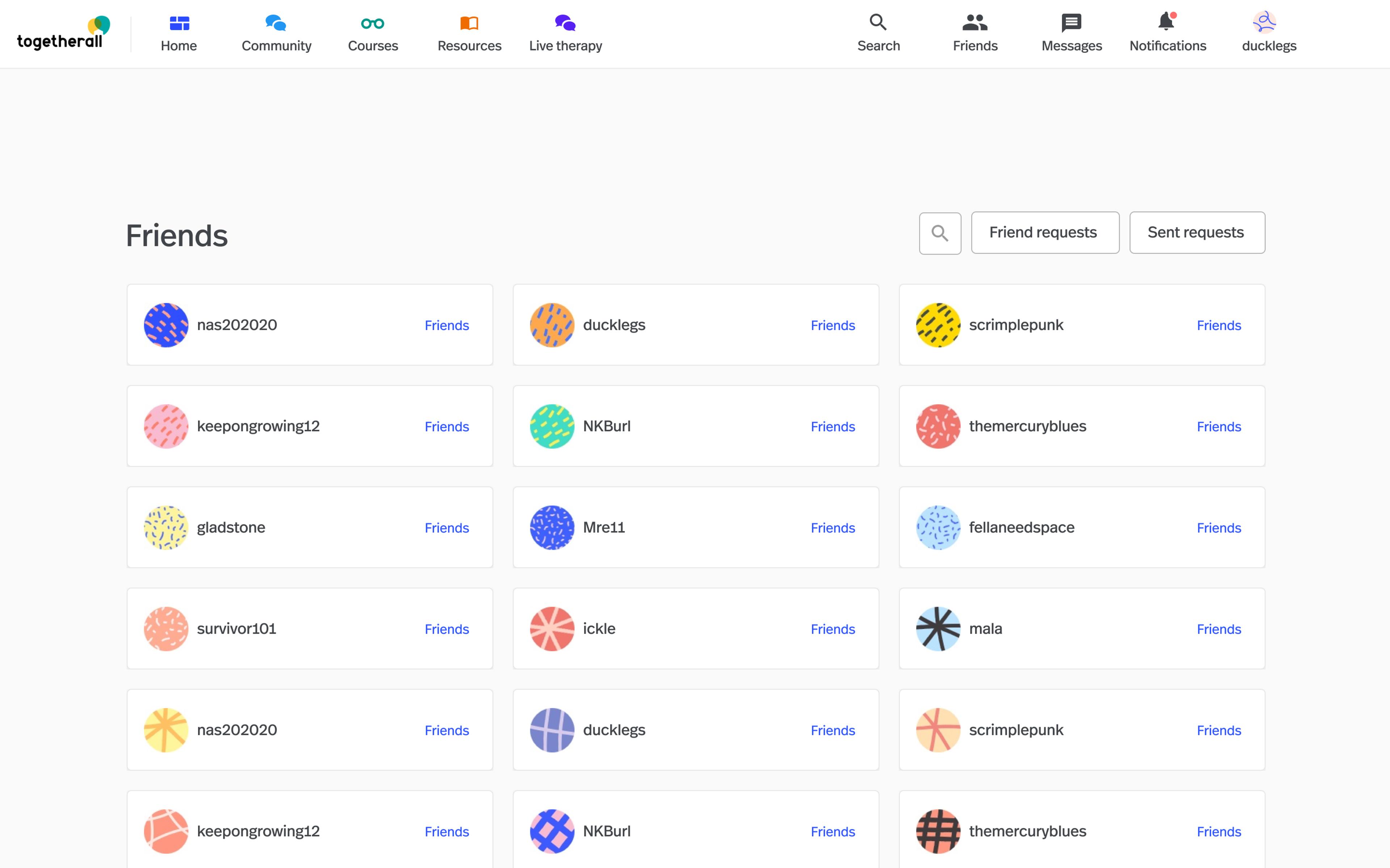
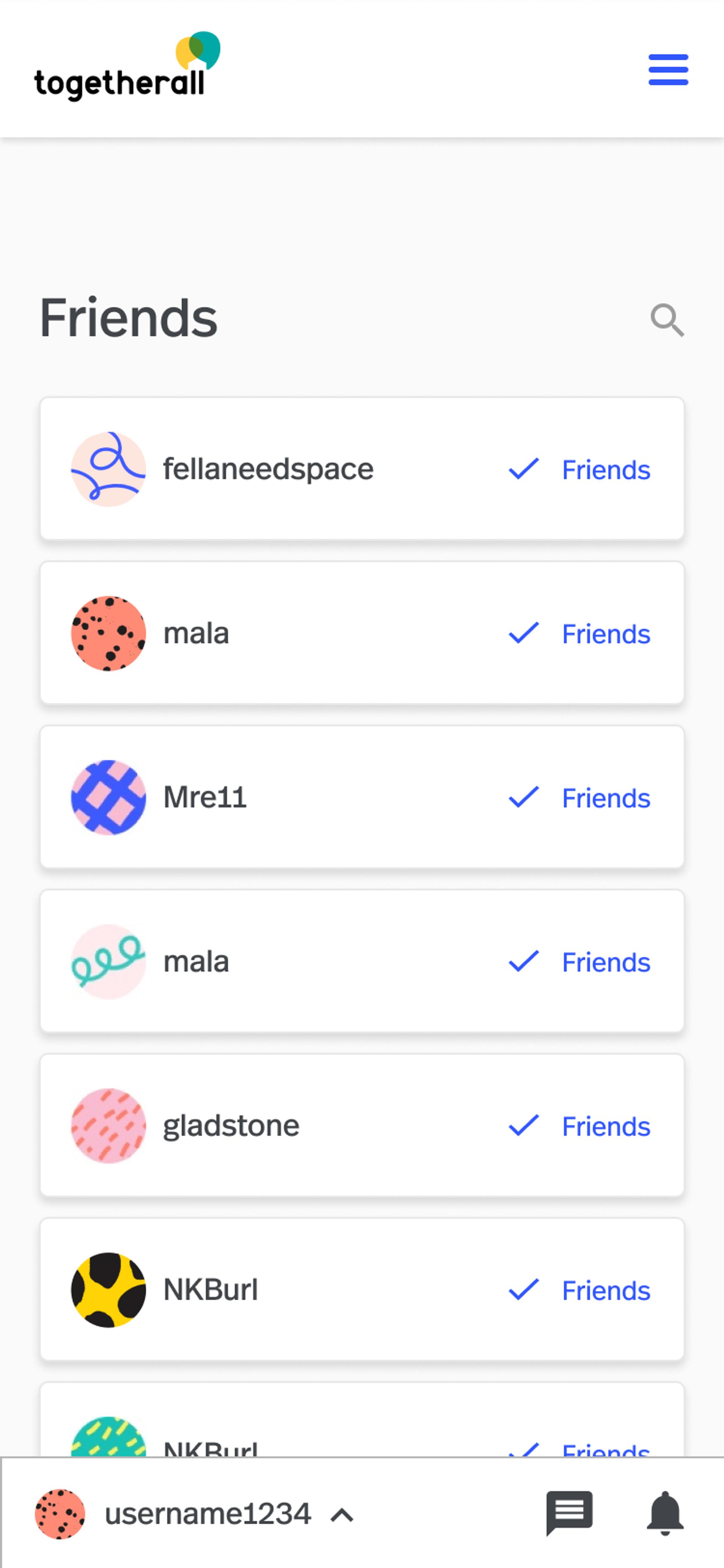
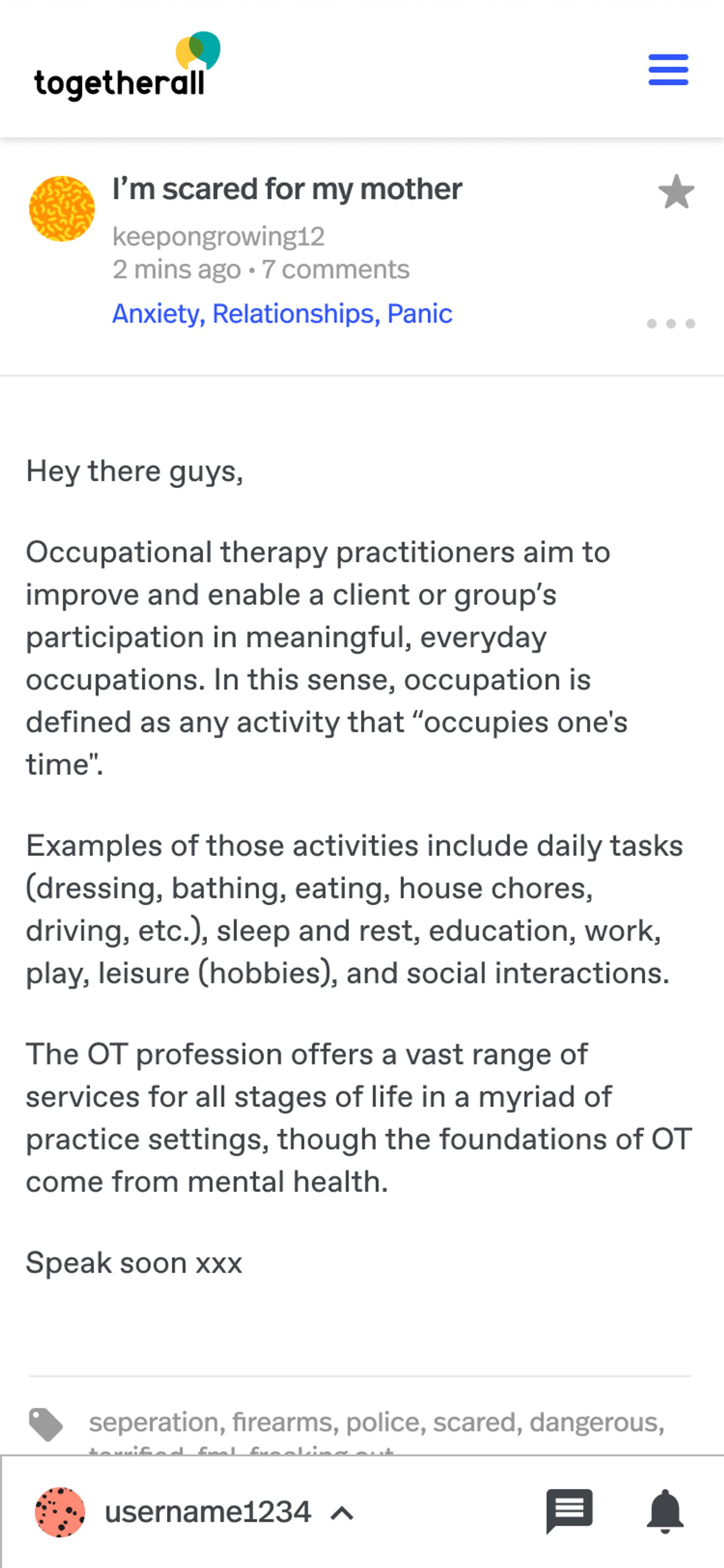
Togetherall is an online community providing a safe space for people to get support with their mental health. Members can share how they’re feeling on an anonymous forum and receive support from their peers on topics like anxiety, depression, stress and trauma, relationship problems, and lifestyle challenges.
Togetherall users range from students, to employees, to members of the armed forces. The platform is partially moderated, with mental health professionals available to step in and offer support.
Having just rebranded from their previous name, Big White Wall, the team approached us to redesign and rebuild their platform from scratch. The brief was wide: retain everything that made the old platform great, while streamlining the experience for Togetherall administrators and therapists.
Sector/Healthcare & Pharma
UX Design
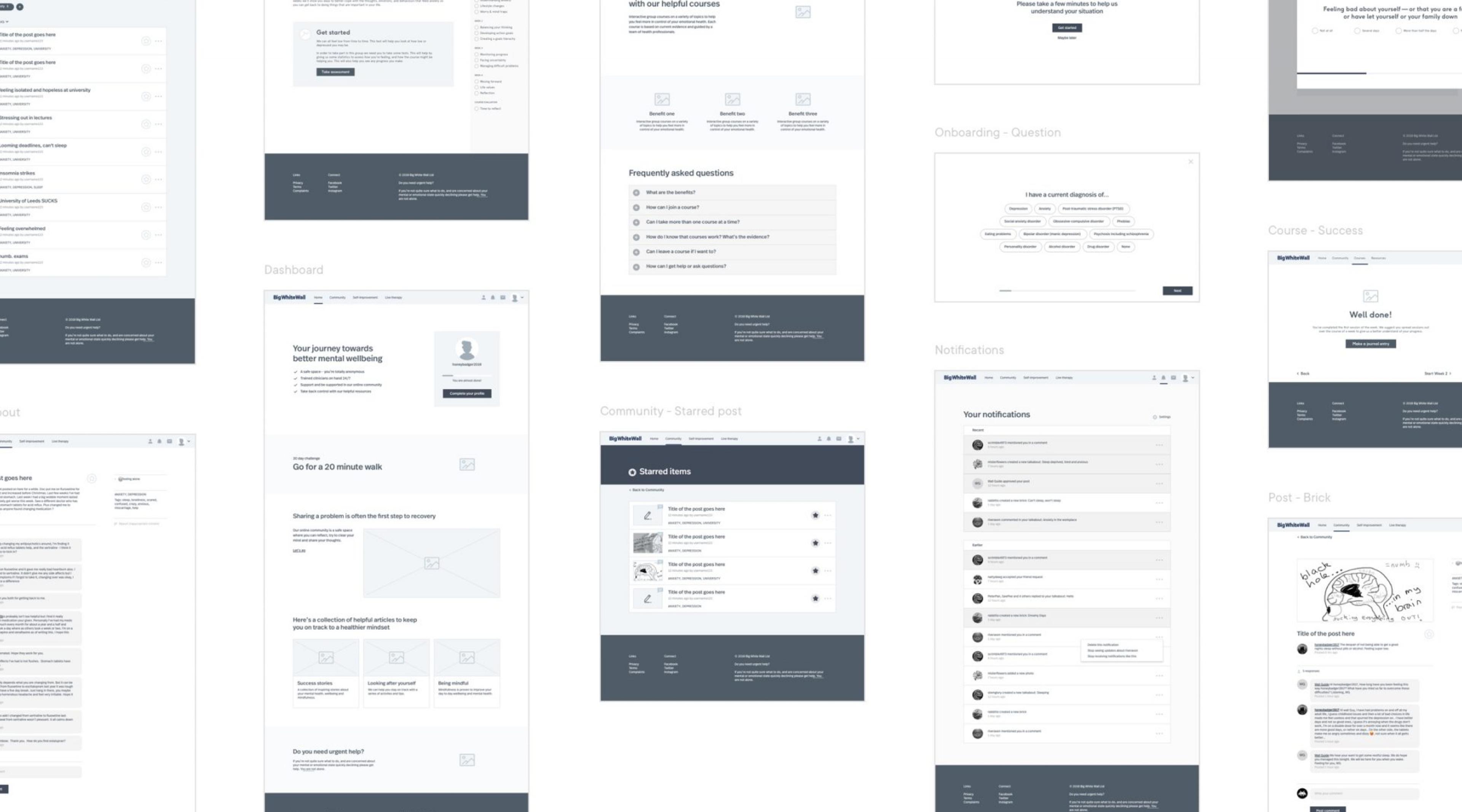
Building a picture of how to improve the user experience
Face-to-face access to an anonymous user base was tricky, so we created a questionnaire and shared it on the platform to gather quantitative insights from the community.
As well as speaking to users, we conducted interviews with Togetherall clinicians, and looked at site analytics. This helped us build a picture of what was already successful and where there were opportunities to improve the experience.
Branding
A fresh start for the user interface
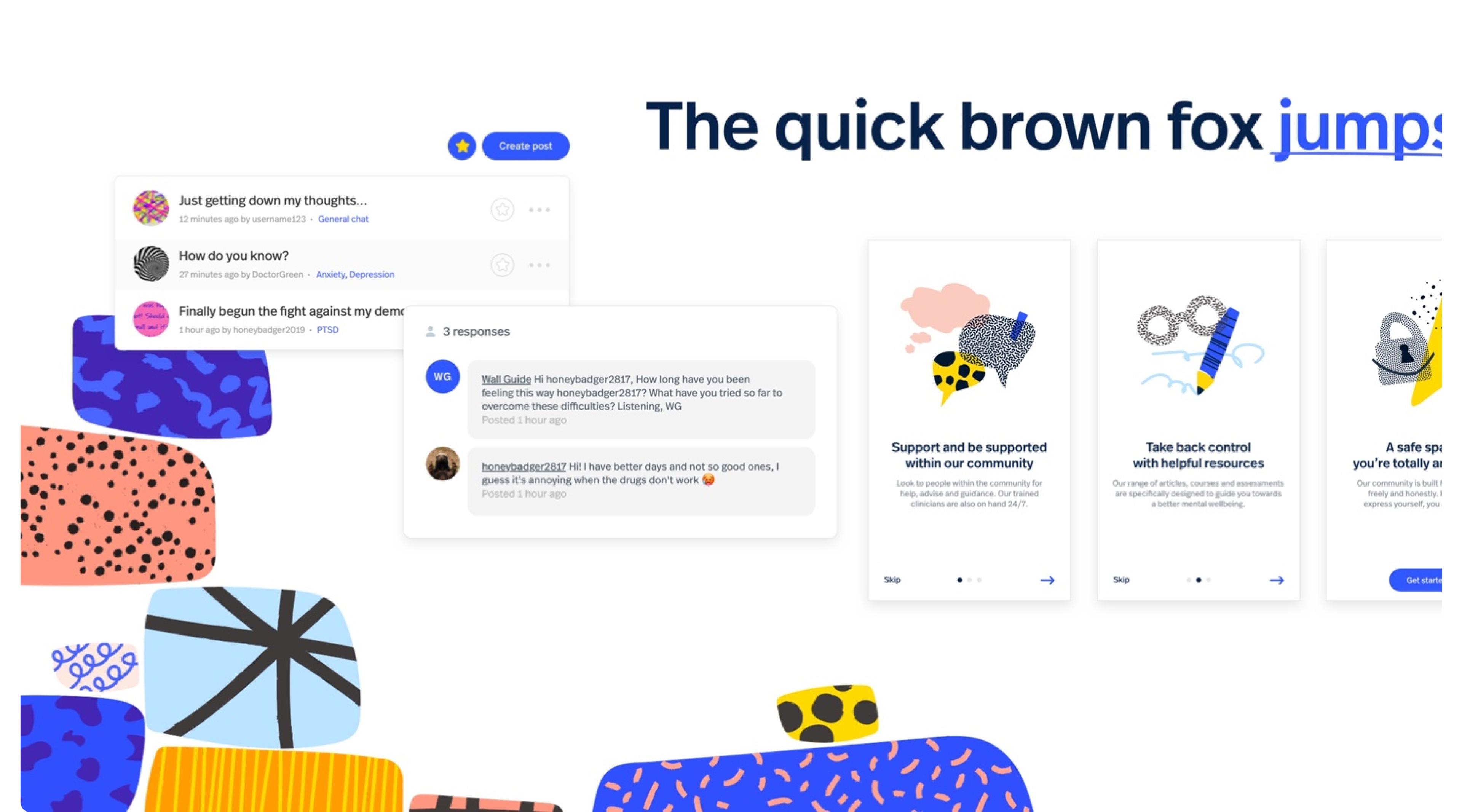
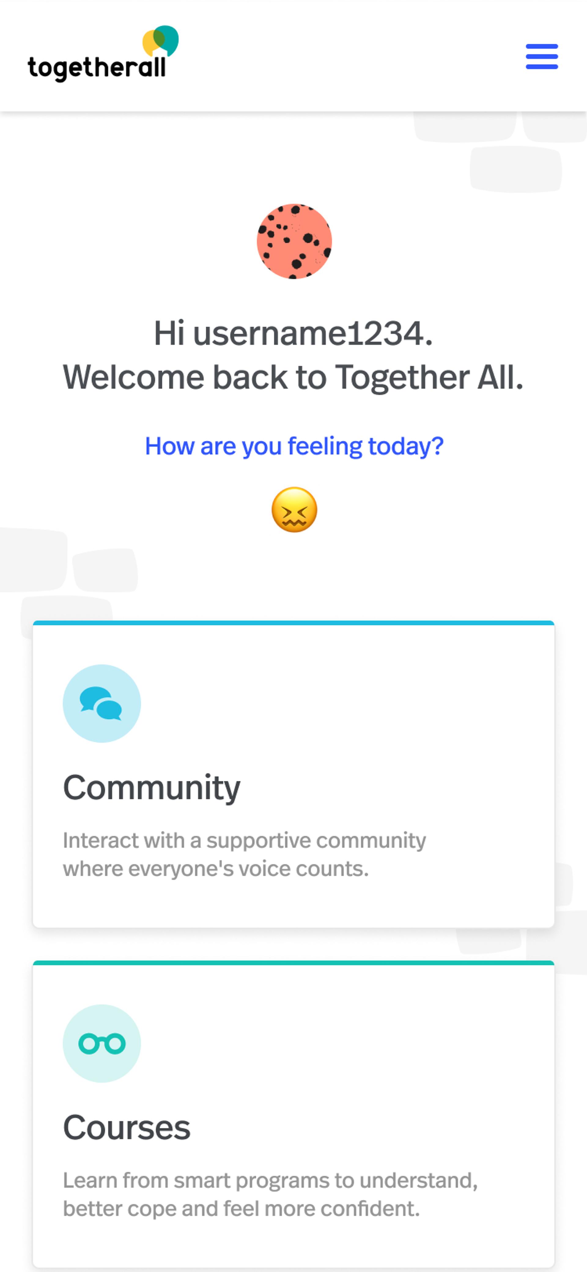
Togetherall wanted to move away from their old look and feel, which had served them well for a while but was starting to feel tired and outdated. Our new brand visuals took inspiration from artwork created by real users, and created a new visual language which felt welcoming, fresh and optimistic. We developed a style guide focussing on clean, minimal design to maximise engagement and accessibility.
UX Design
Architecting a solid new structure for the site
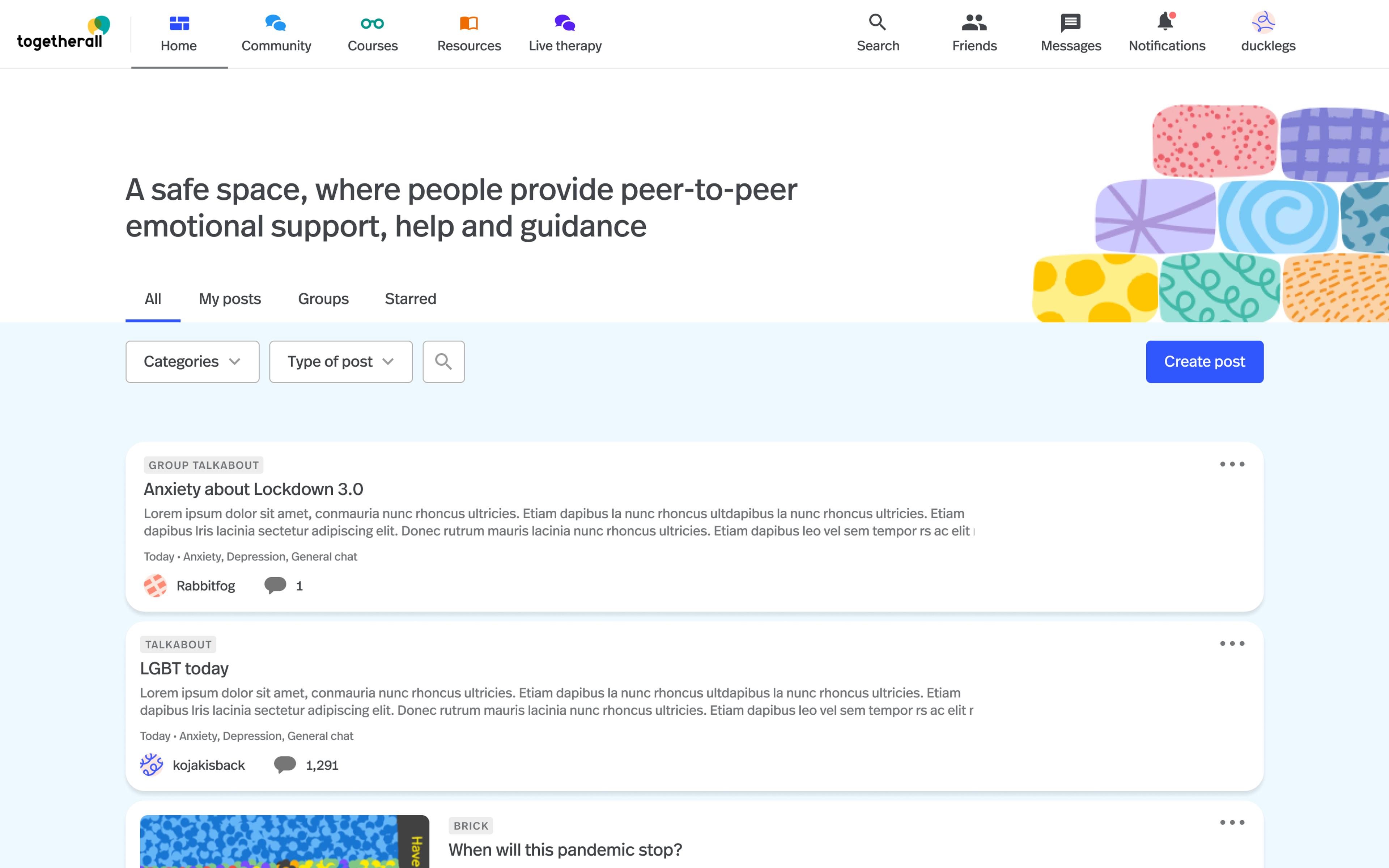
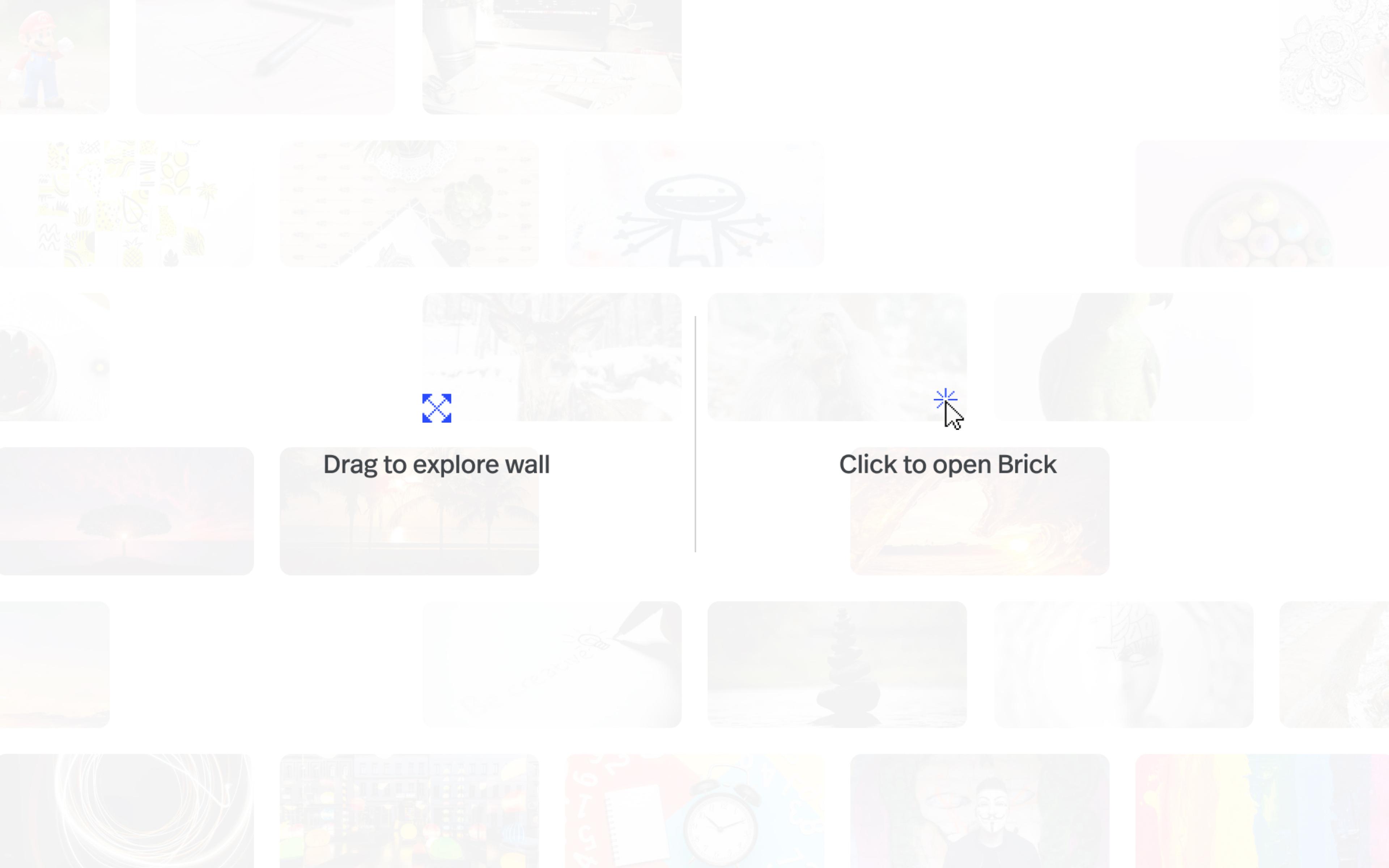
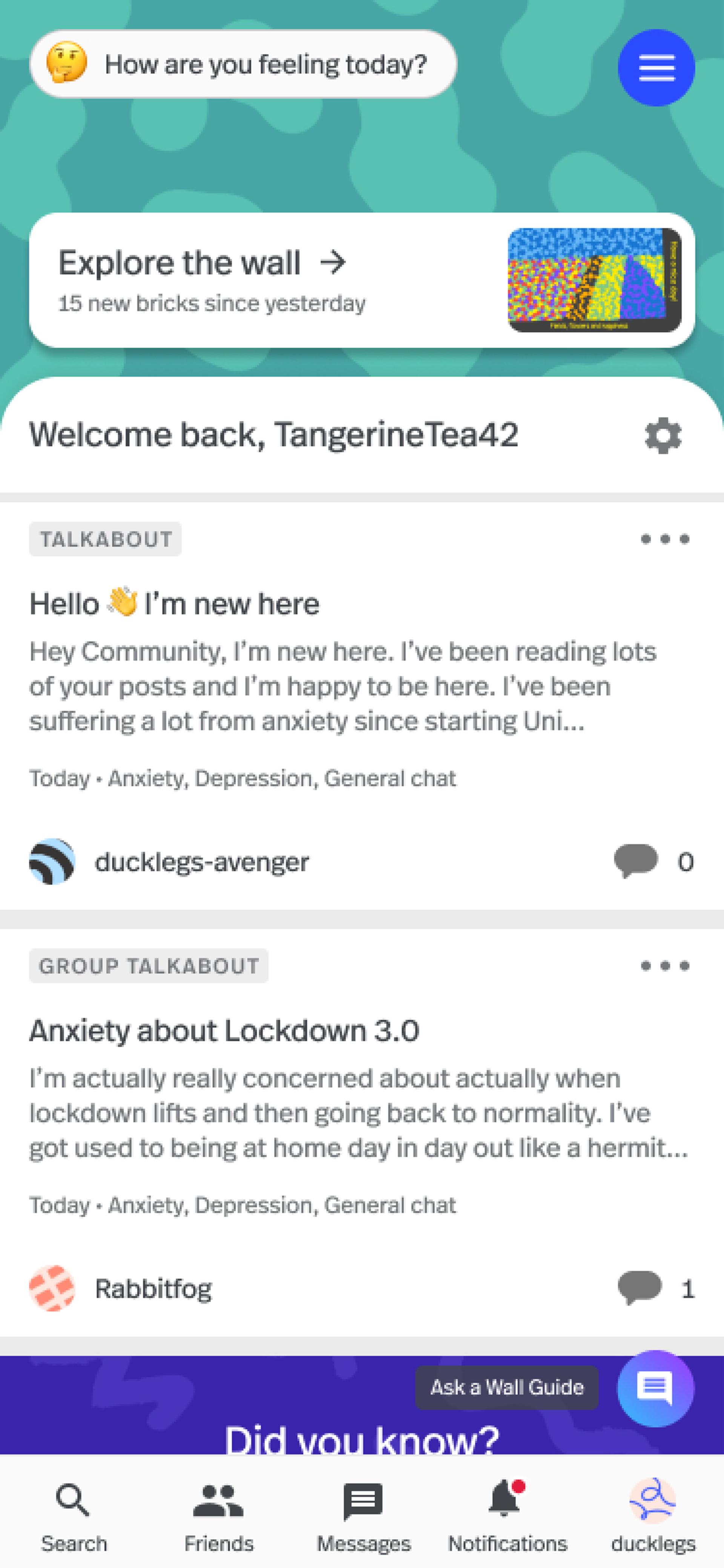
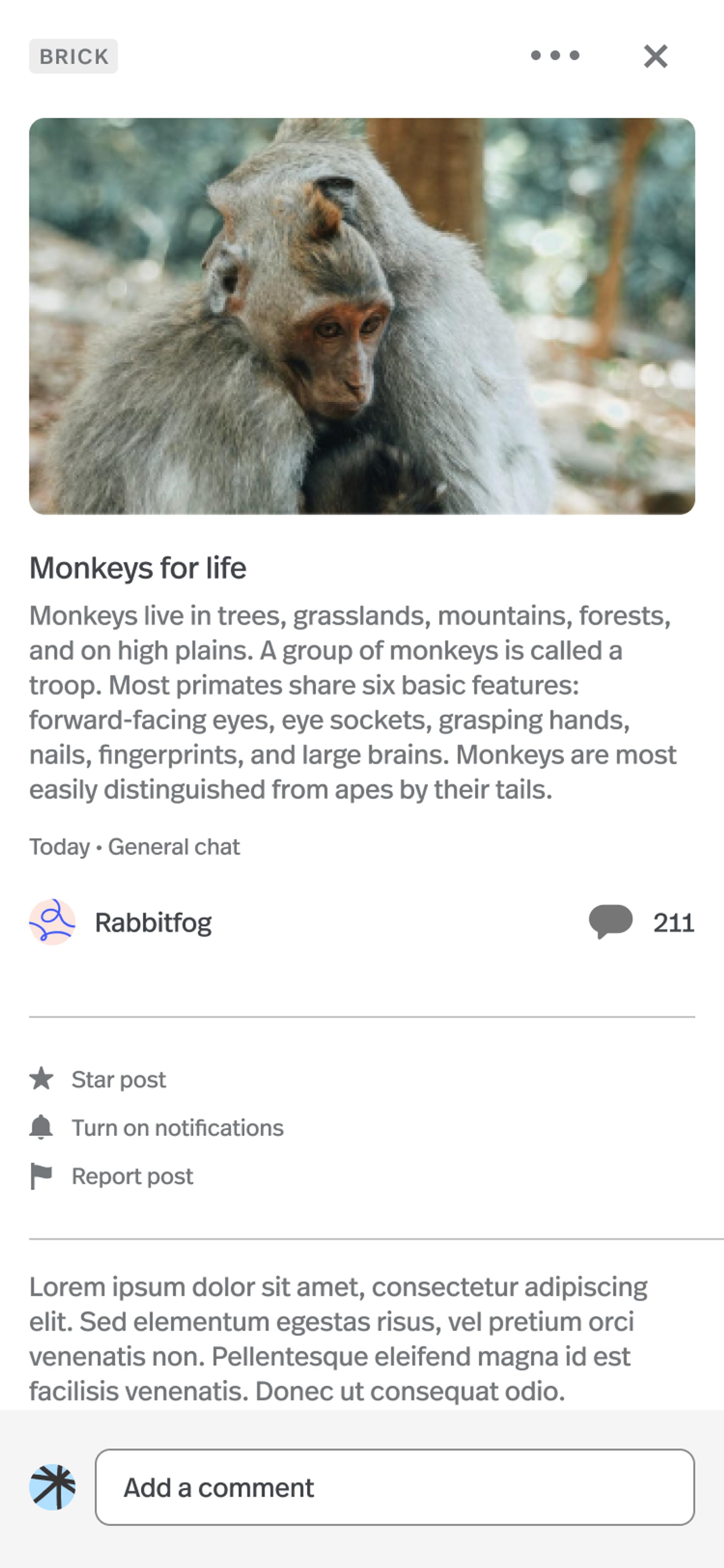
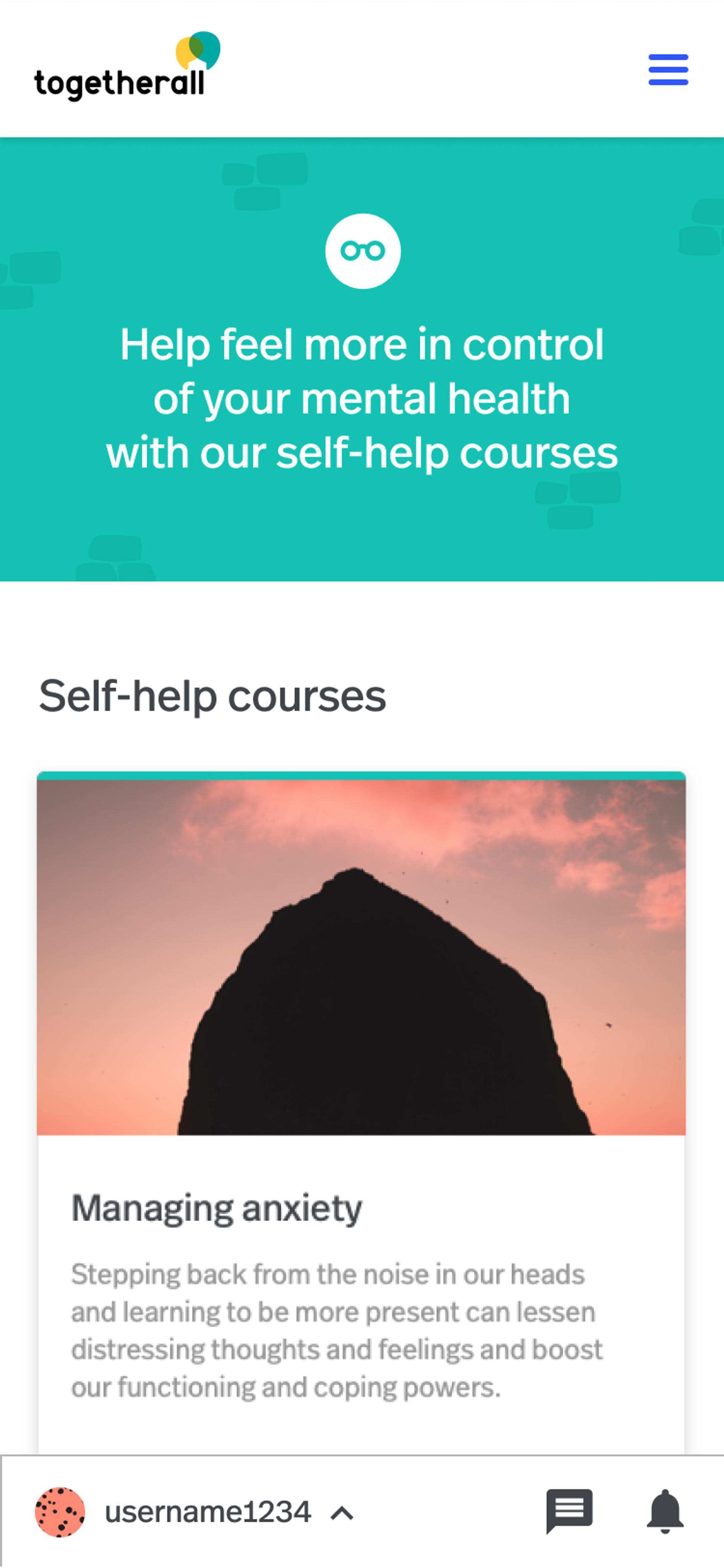
We reviewed the existing structure of the platform. We created the Community to bring written posts called Talkabouts closer together with visual artwork of the Bricks. We also reformatted sections for Courses and Resources to capture the other two key pillars of the support network.



UX Design
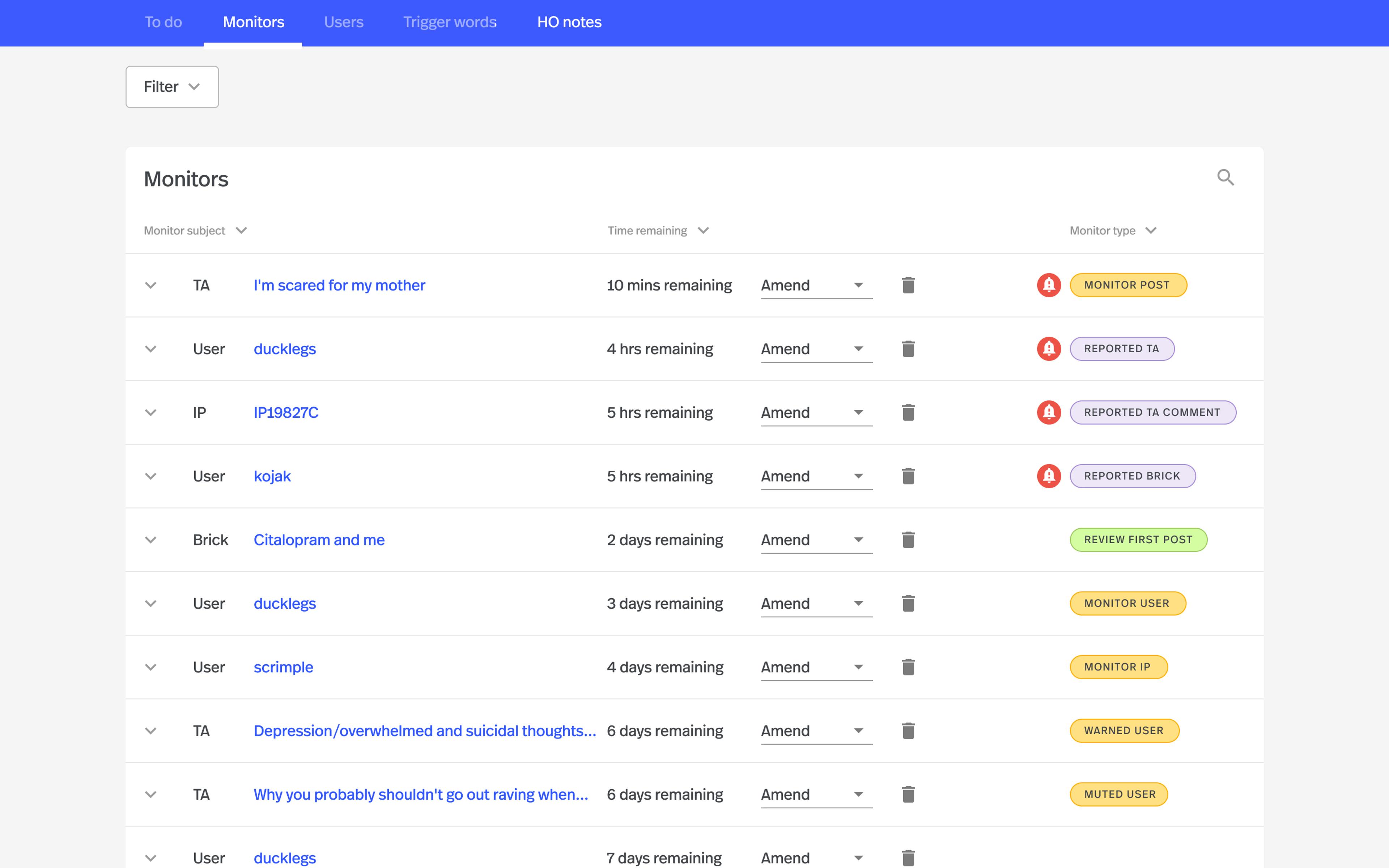
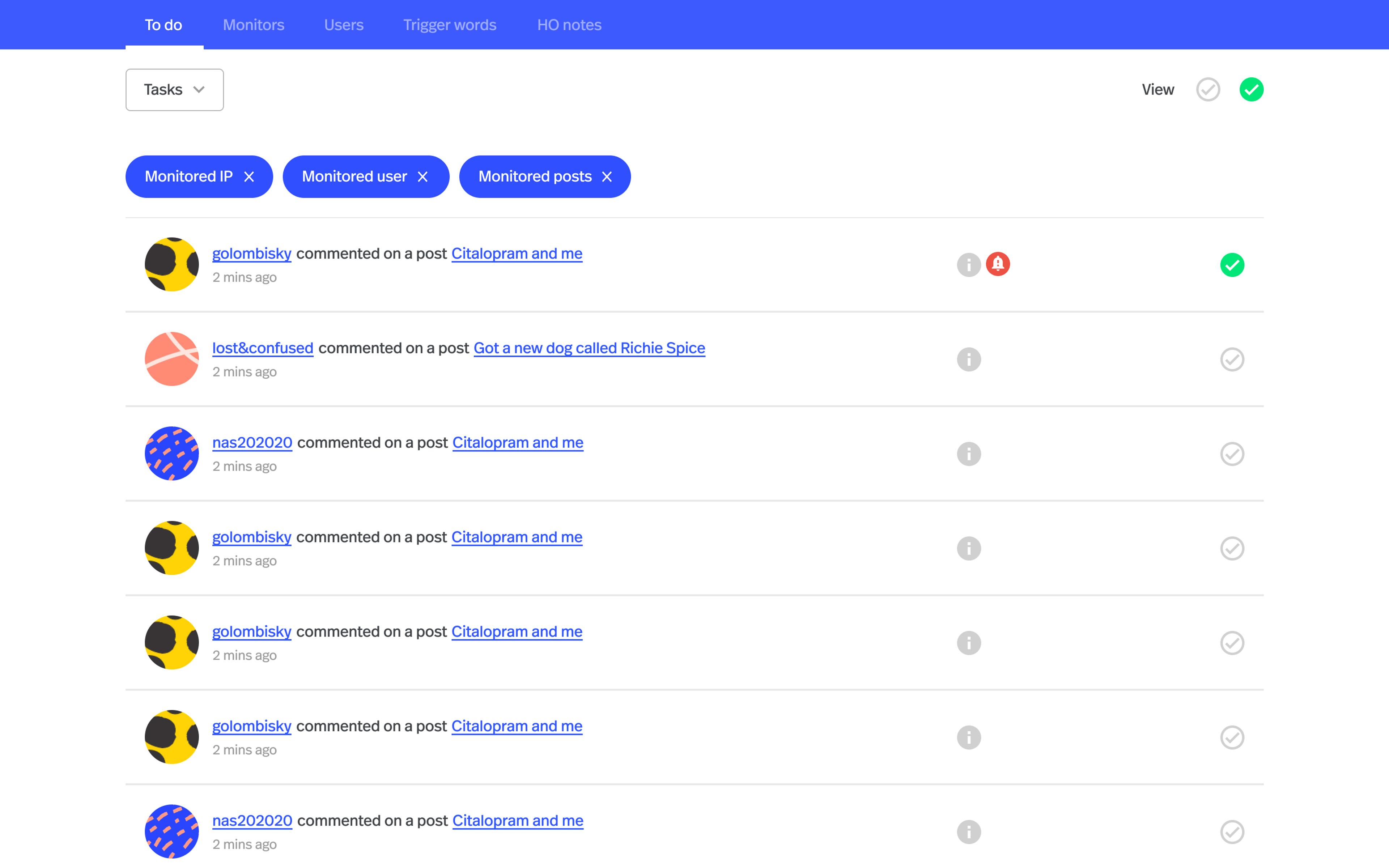
Moderation on a whole new level
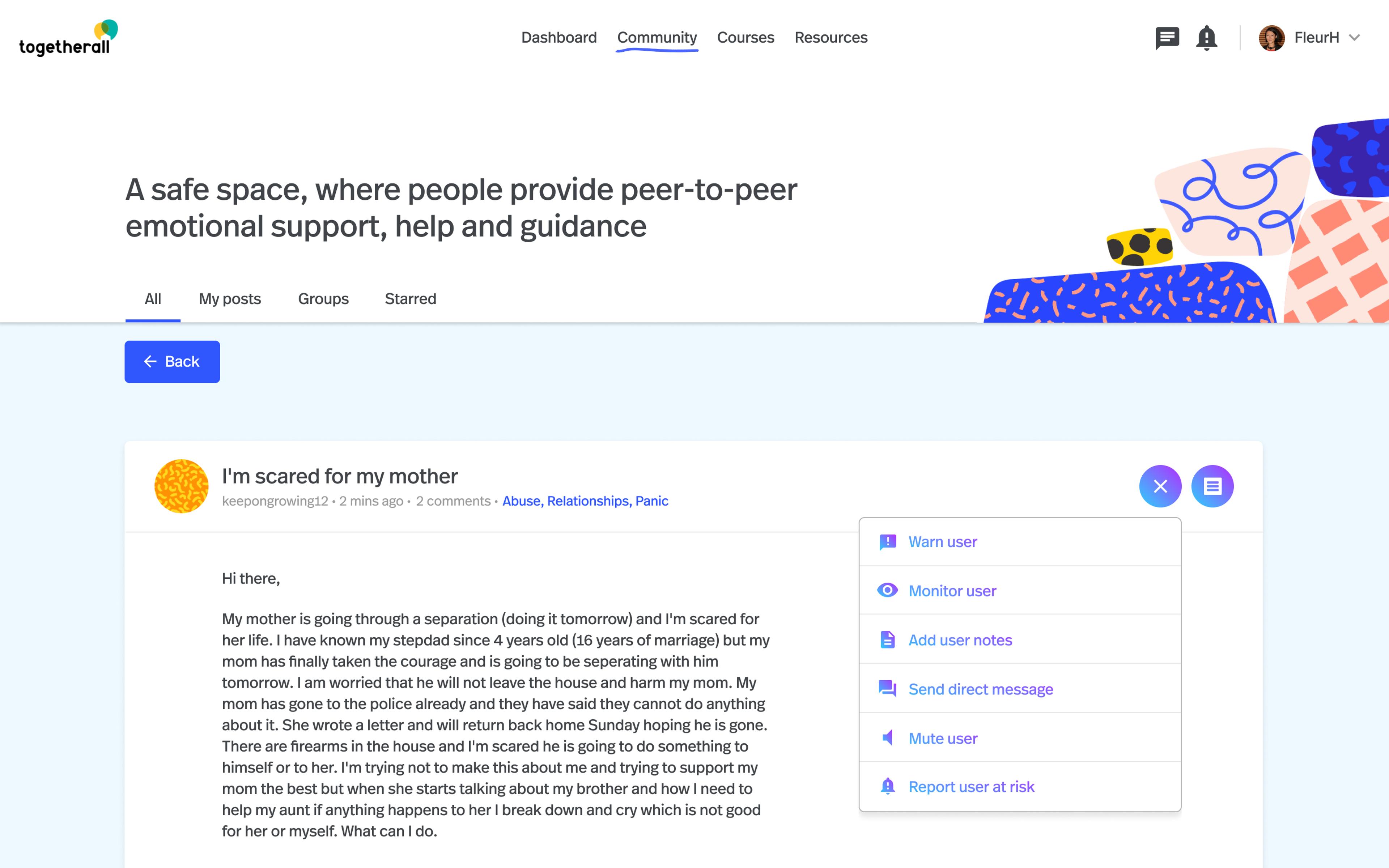
The overseers of the platform are called Wall Guides. Wall Guides are clinically-trained mental health practitioners who monitor and moderate the platform 24/7. They are integral to the value of Togetherall; providing a safety net by intervening, guiding, and supporting member conversations.
The platform is the primary means through which they deliver care – so it needs to be fast and intuitive, and combine custom functionality with the real-time user data that enables them to efficiently do their jobs.
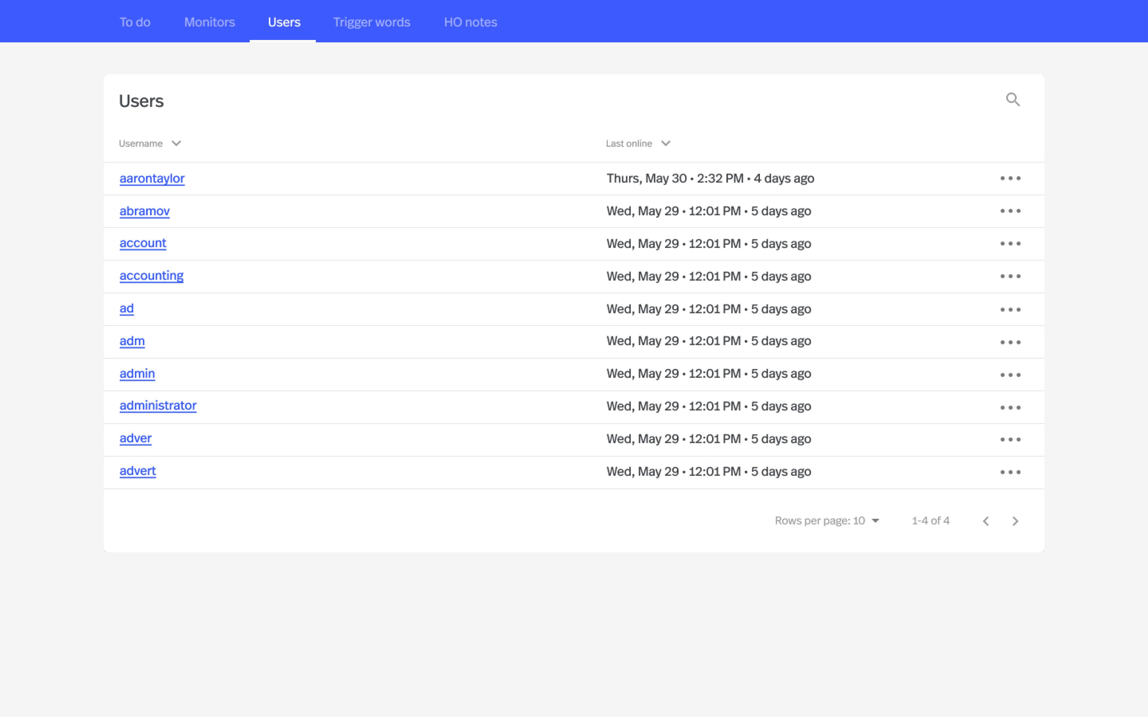
We created a dashboard that dynamically flags issues and generates tasks for the Wall Guide team to complete. Tasks are created in response to the use of trigger words, user activity that indicates risk, and whenever new content is published to the Community.


Technology
Data, data, data
To ensure the security of the platform and its data, we made sure to architect the system in a way that would meet both: (1) the legal and regulatory compliance requirements of an increasingly data-conscious world, and (2) Togetherall’s ambitious growth plans over the next decade.
Using a three-tiered approach for the platform, splitting the front-end into elastic apps, and hosting everything behind load-balancers means we can update any part of the system independently, without downtime while every other part of the system runs full-speed.
The data and all internal network traffic is encrypted, and no parts of the system are exposed to the Internet other than the front-end apps.


Technology
A seamless launch plan
With members relying on the platform for their wellbeing at potentially any hour of the day, taking the site offline was not an option.
We began the launch process starting at 2AM on a Monday morning – to make the most of the low traffic in the daily cycle of the existing platform – and finishing on Wednesday evening. We made sure that every one of the millions of data points was transferred without the site ever being down for members.
Testimonial
“Neverbland demonstrated early on that they shared our values and quickly earned our trust with their pragmatic approach to a project too important to fail. Their replatform strategy meant we could announce ourselves in the market, were ready for rapid growth, and avoided any impact on business as usual. Judging by the impact it’s had, I know we made the right choice.”

Henry Jones
CEO, Togetherall
Technology
Continuously enhancing the platform
The launch was the first step in a continued partnership between Togetherall and Neverbland. Over the last two years, we have enhanced the platform with additional features, courses, and resources, specific support pathways and multilingual support networks all of which have helped to position Togetherall as the preeminent support platform for mental health.
The enhanced platform has helped to underpin their extension of support to many more people across the globe that will be further supported by a $10m investment by FPE Capital LLP.
Crucially, Togetherall has been successful in supporting its members, with 71% users finding Togetherall more helpful than other support they had accessed, and 53% feeling less isolated as a result of the community.
