Intro
eCommerce site for an ambitious startup who took the home decor market by storm
About
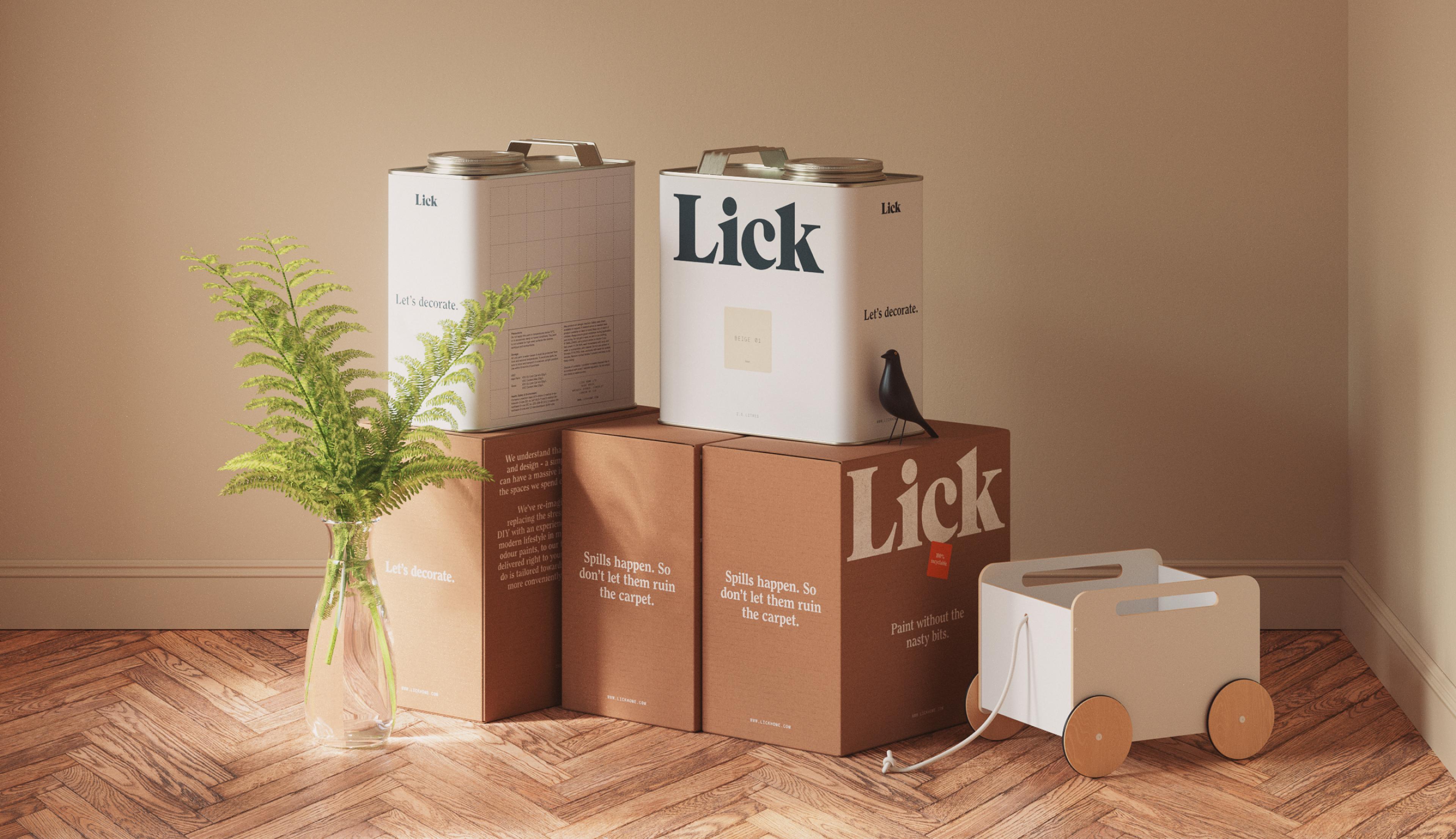
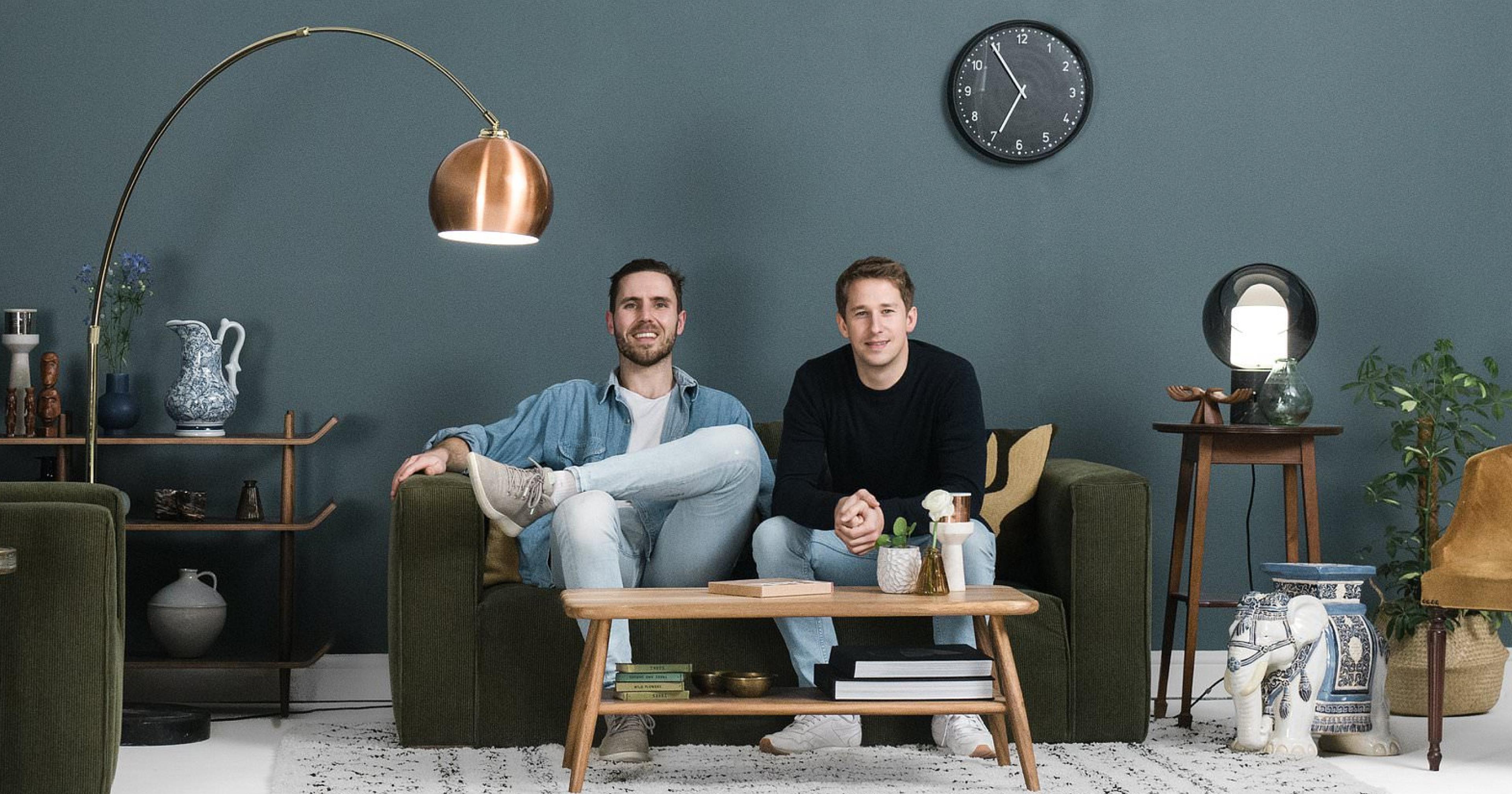
Only 4.5% of paint sales occurring online. Nuts right? The founders behind Lick set out to disrupt the industry and create a new age decor company that delivers straight to your doorstep.
Sector/Sustainability
Credits/Branding/Two Times Elliott
Learnings
Demystifying home decor for the modern day DIY’er
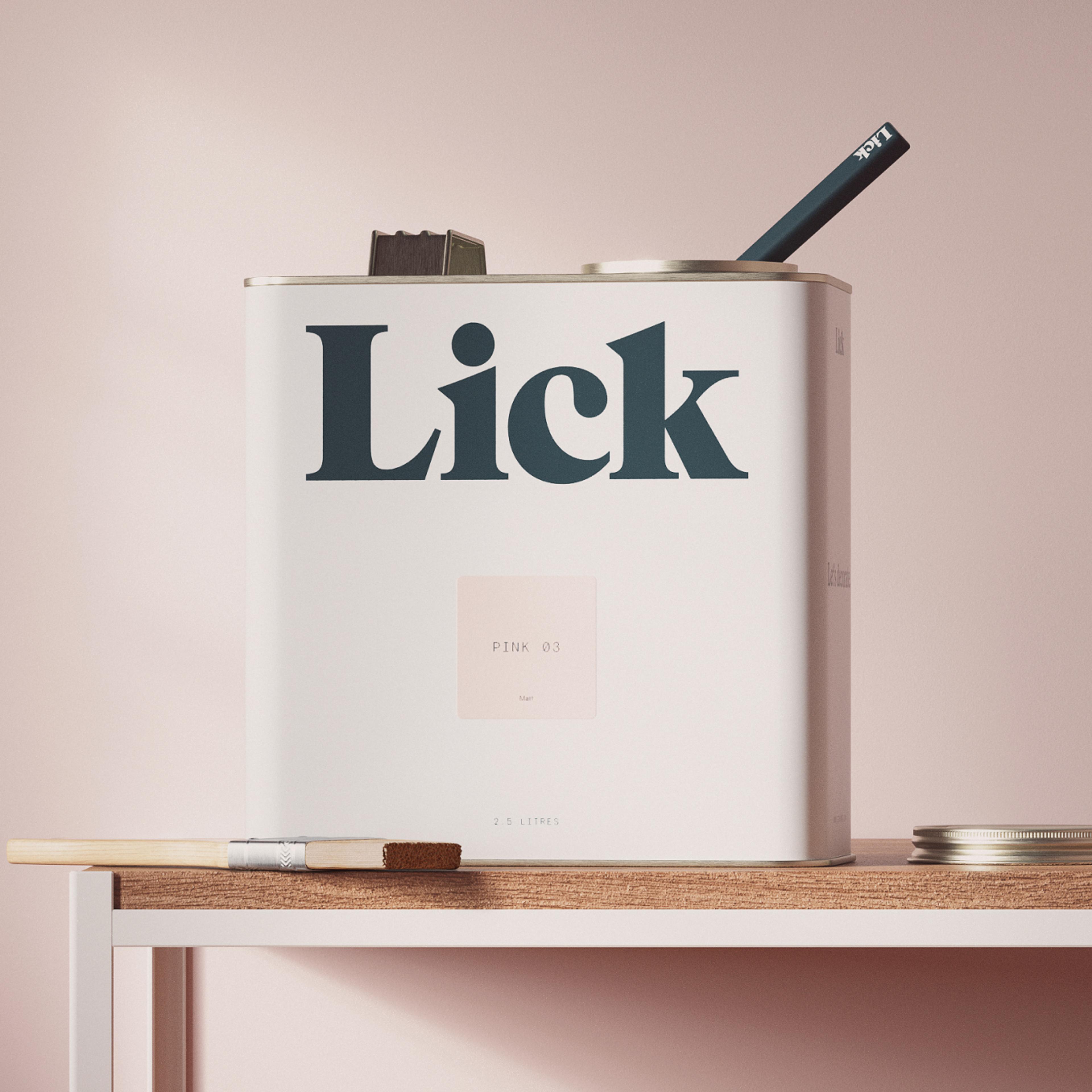
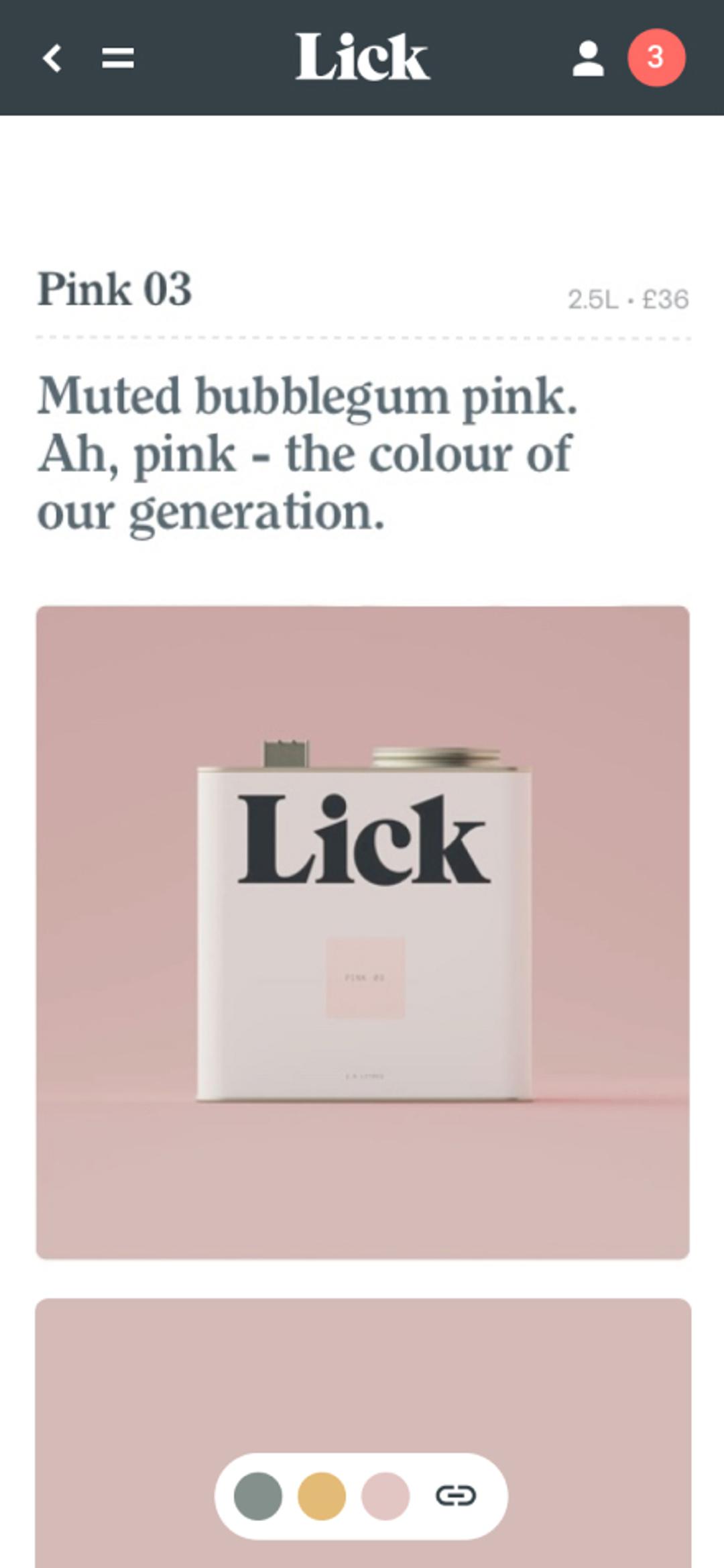
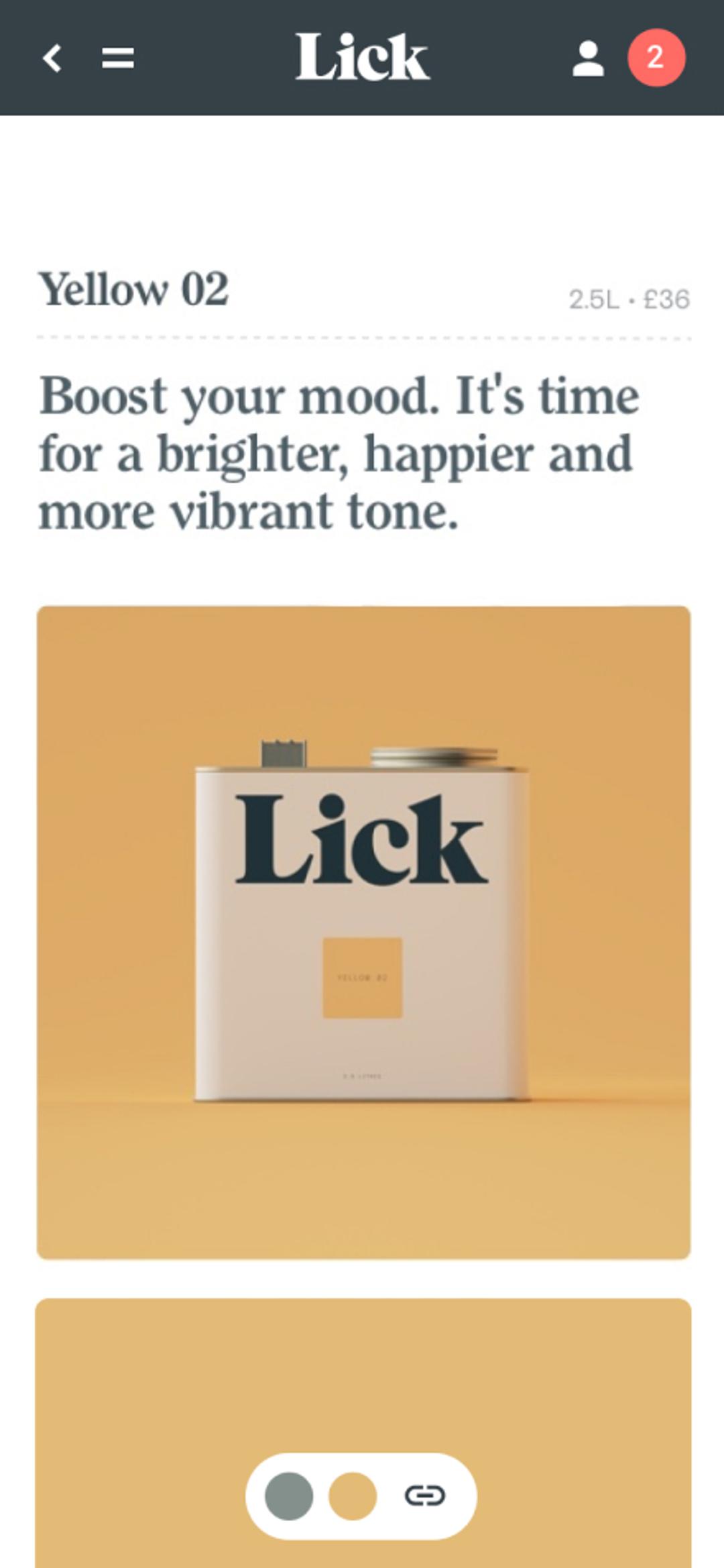
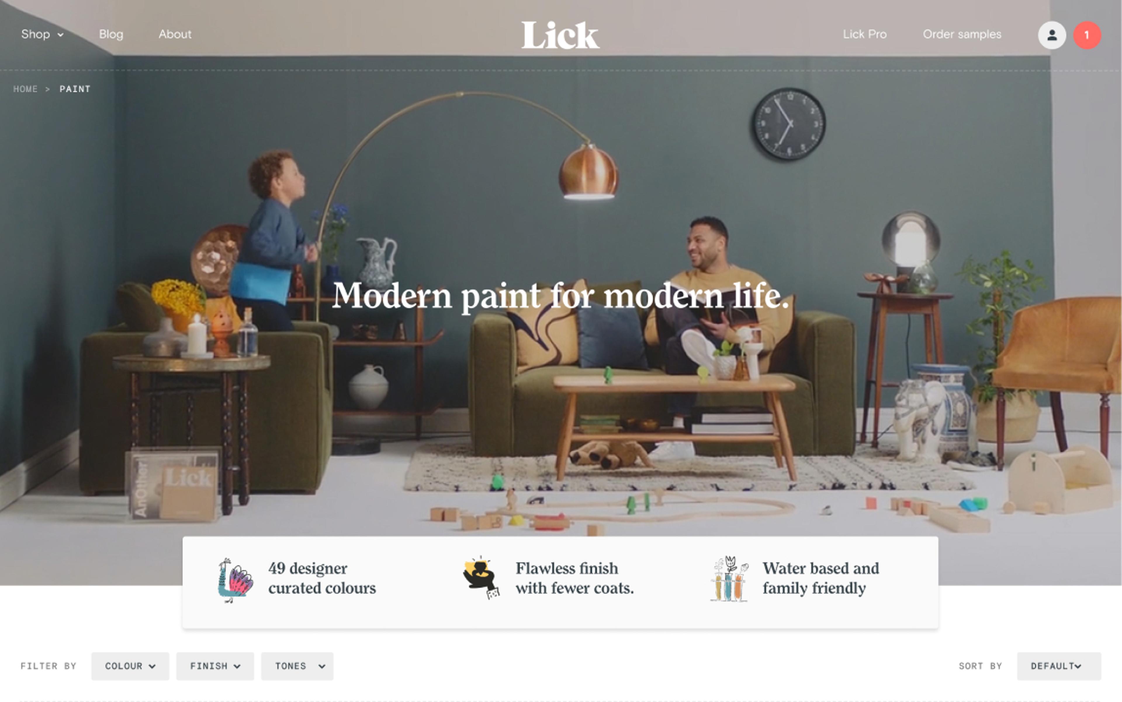
Breaking down industry norms into terms that people understand is something that permiates the entire digital experience. Instead of offering vast colour ranges, with questionable product names like Probiscus Fur or Croydon Rock, Lick worked closely with leading interior designers to define a small but perfectly formed colour range. Simply named by number. No more Silk Matt Mid Sheen Emulsion. Keep it simple – just Matt or Eggshell.


UI Design
Streamlining sample packs
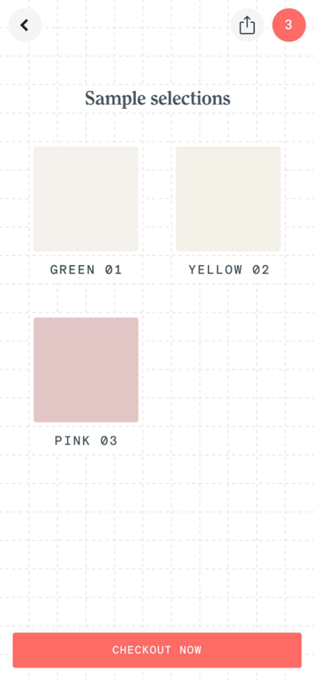
Goodbye messy paint pots, hello stickers. Why doesn’t every paint brand do this? We love it.
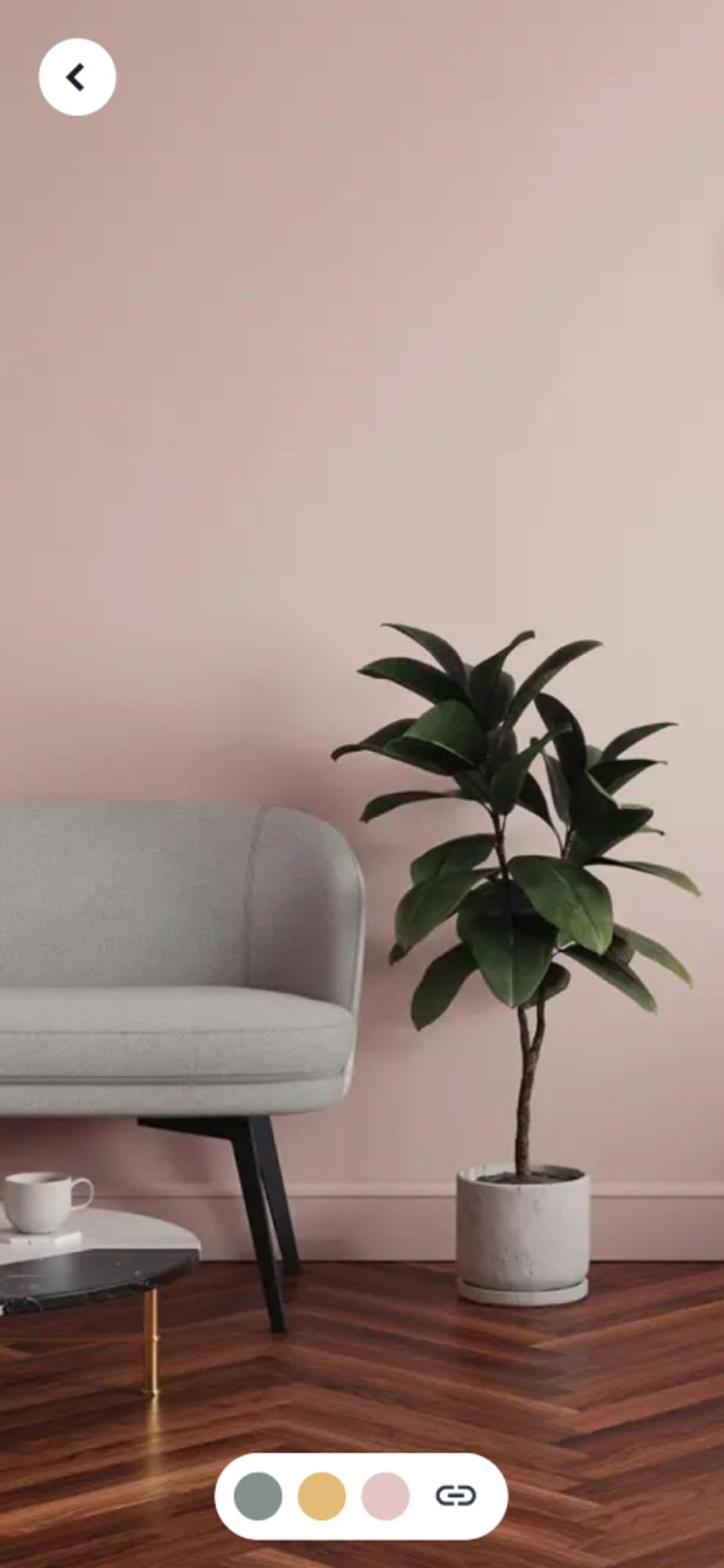
Samples can be purchased for a fraction of the price of paint pots, and have the advantage of transferable stickers. Game changer. We designed a feature allowing users to populate a mini colour palette to share their colour selections with friends for feedback.
Testimonial
“They made the project feel easy. Collaborative, as well as focused, responsive and super friendly. The site Neverbland built for us was fantastic and has performed extremely well and given us a great start. That's all down to their level of commitment to deliver awesome work and really understand the problem we were trying to solve.”

Lucas London
Founder, Lick
UI Design
A design system that heroes paint colours
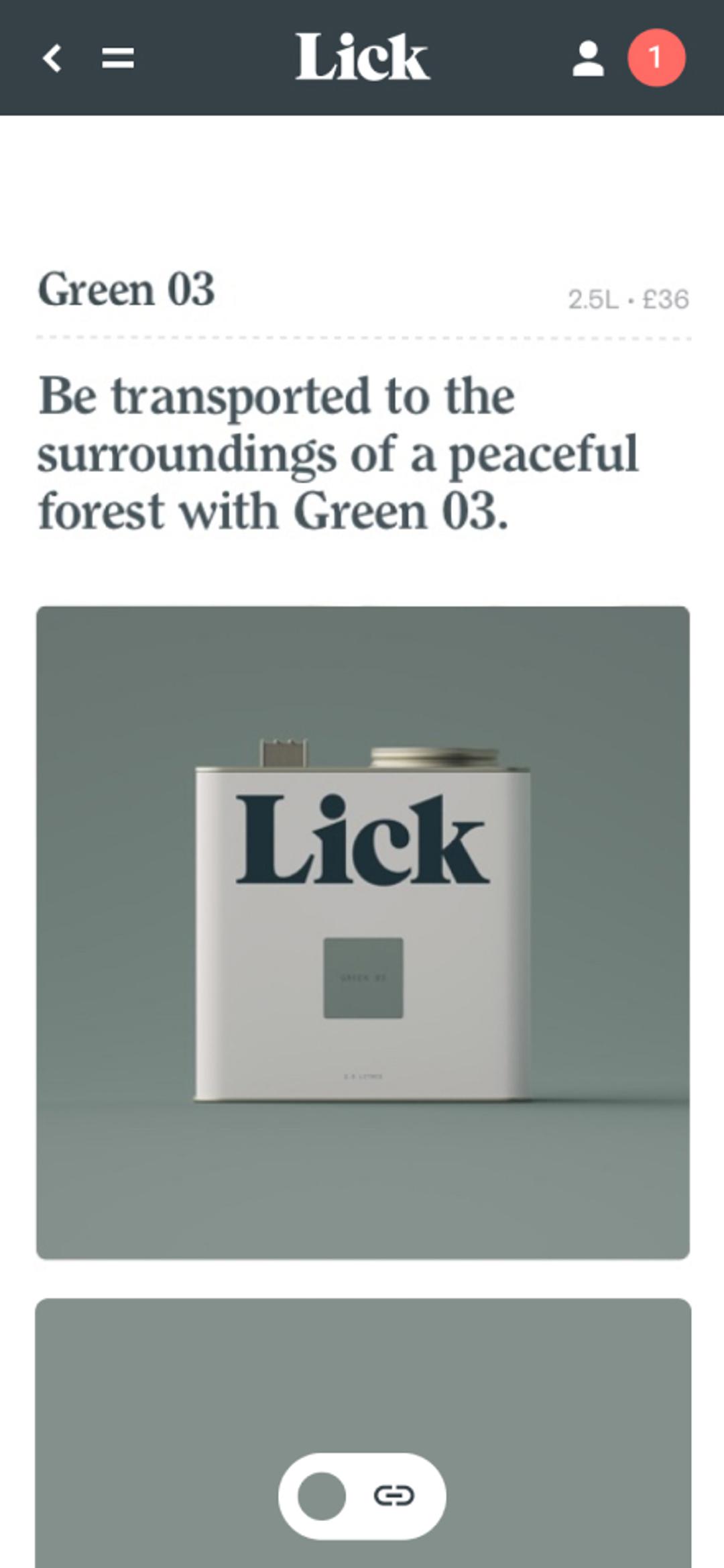
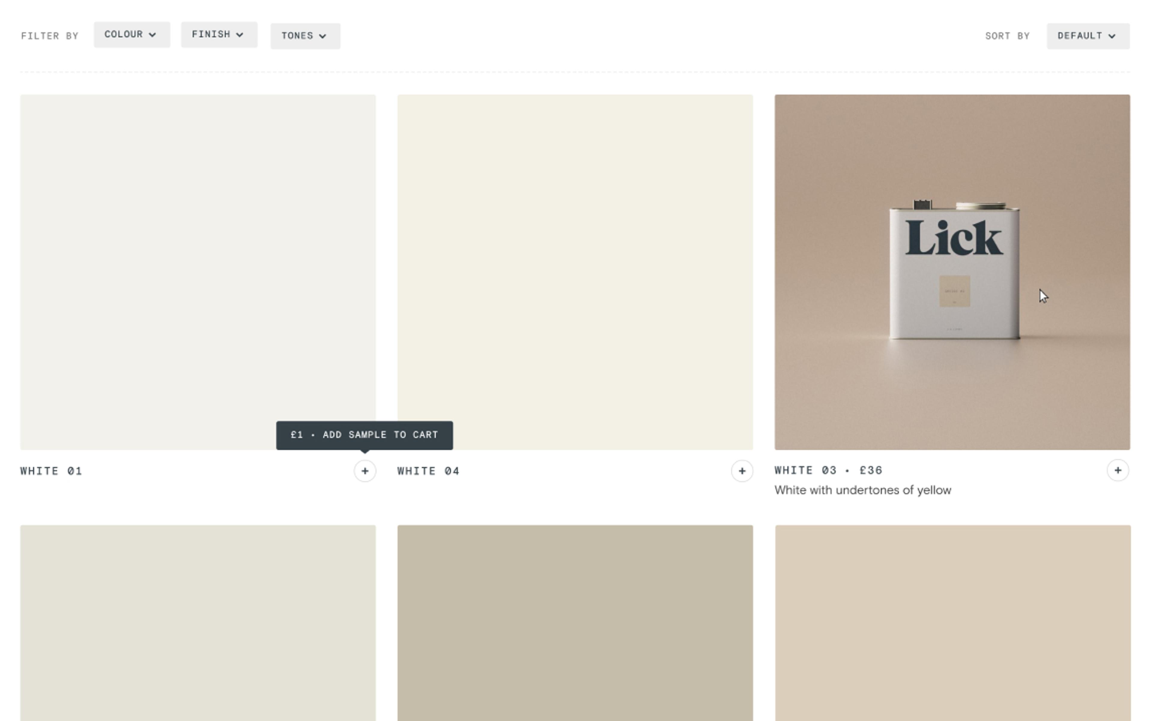
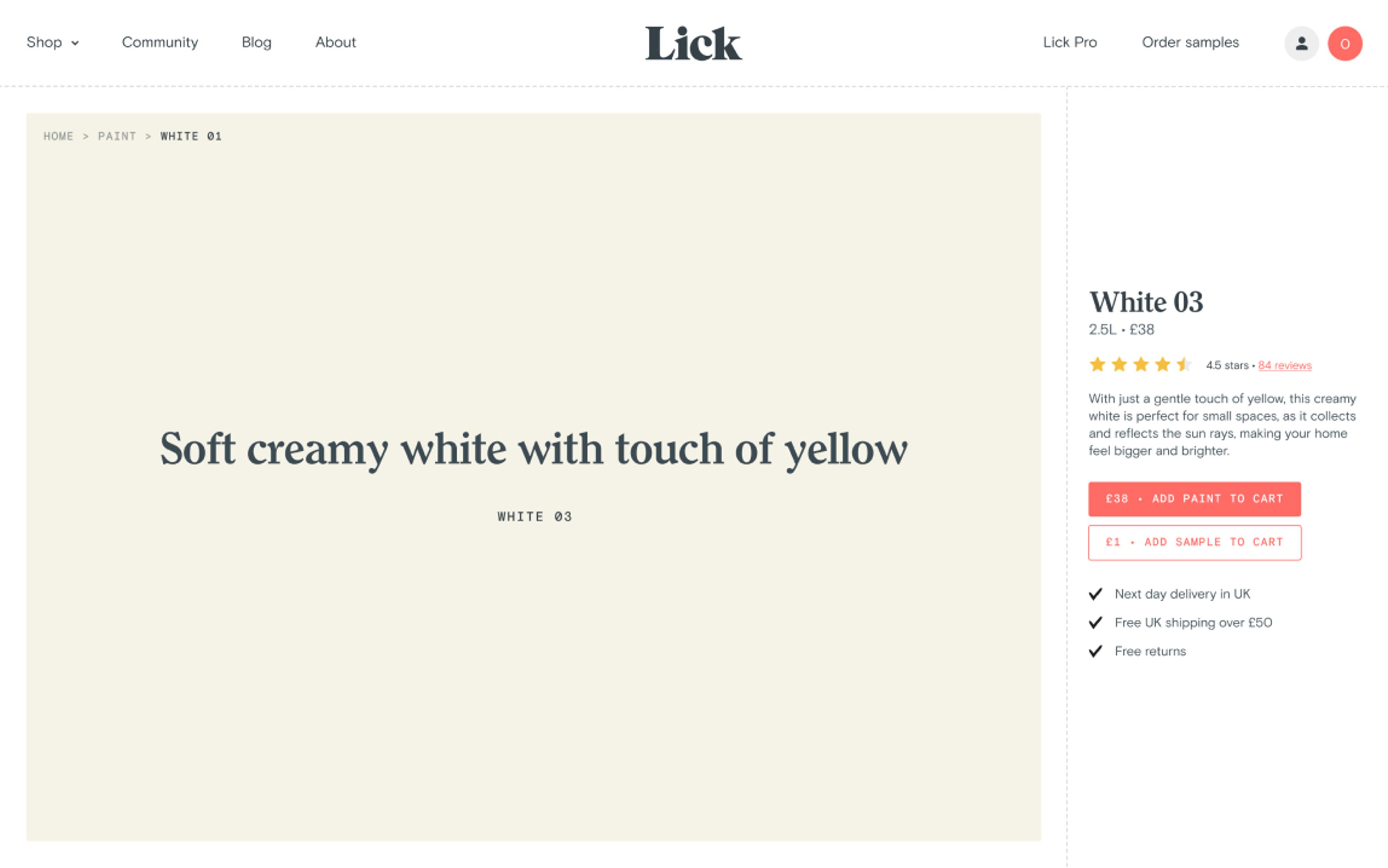
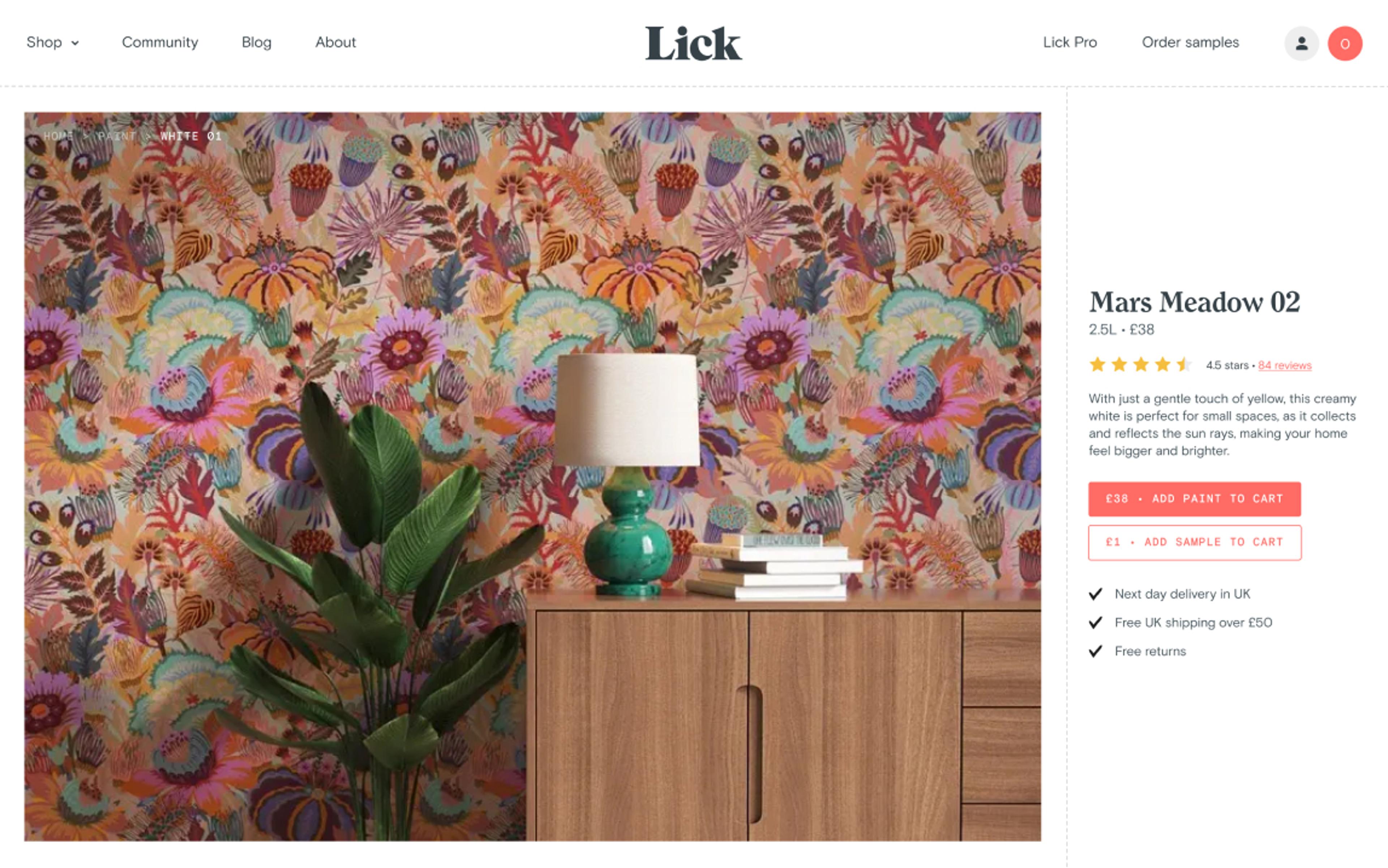
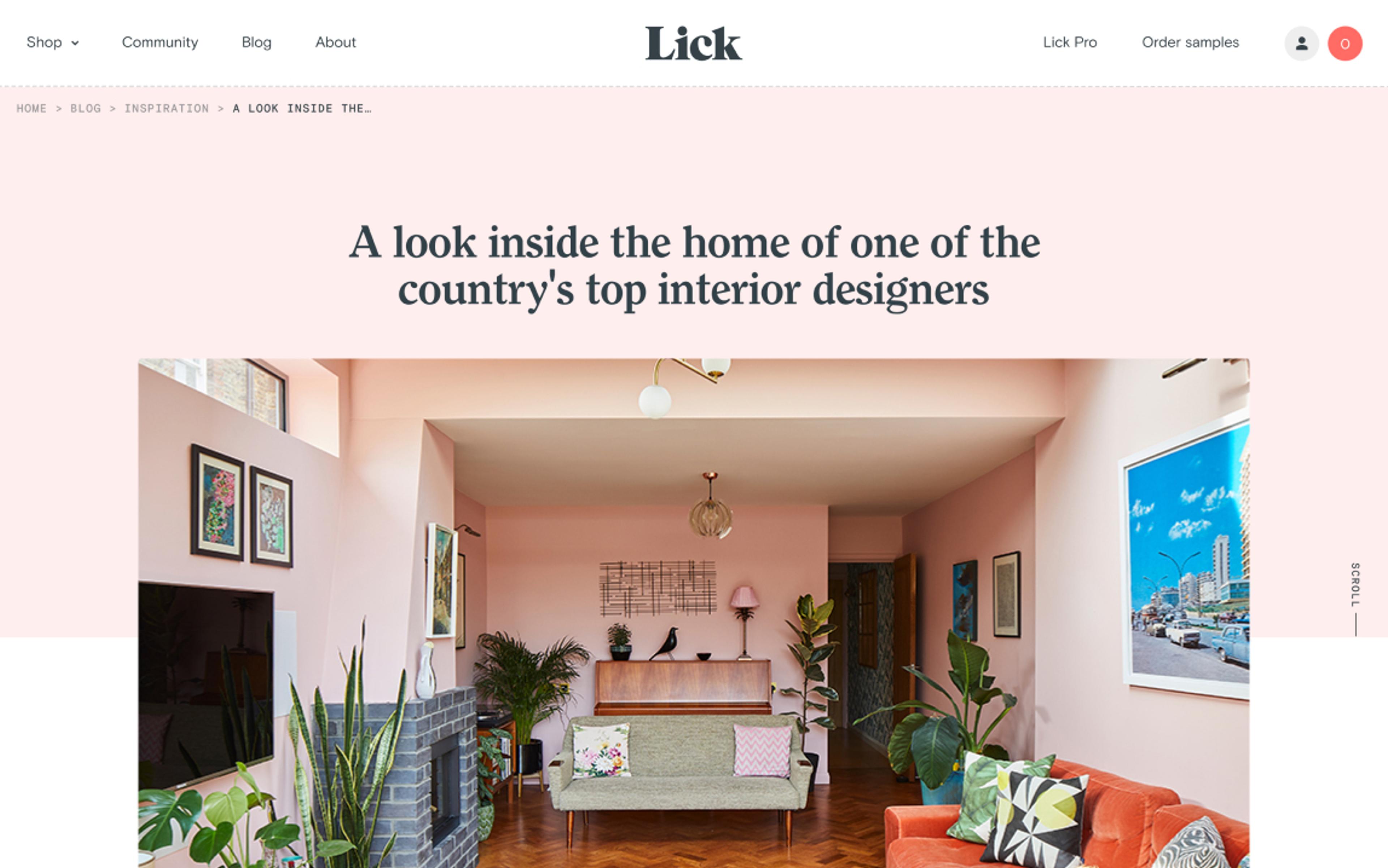
Our design ethos was to create a simplistic, uncluttered, white canvas to contain the colours clearly without interruption. The sample stickers are square with rounded edges reflected in the user interface design elements.
The industry standard appears to showcase colour ranges on minature paint tiles on screens with vast numbers of choices. The human eye sees colours differently when alongside other colours so we pushed for enlarged product tiles to help users effectively and accurately browse colours.


Technology
A solid base layer
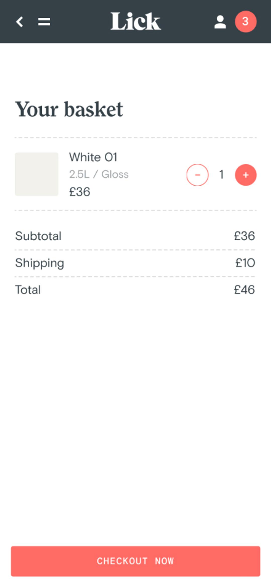
Shopify is a powerhouse of useful tools to create products and variations, link them with a fulfilment centre so that inventory gets updated in real time, get orders coming in, link with a shipping partner to deliver said orders to your customers, manage returns, cancellations, … you name it! So it felt like the perfect choice for us
But when it comes to their themes? Well… It’s not as funky… For that reason, we decided to build our own custom front-end based on React and to rely on Prismic CMS to make the content 100% editable by Lick.
Combine the two and what you get is the benefit of everything Shopify offers with the creative freedom of offering a carefully curated User Experience coupled with a blazing fast build. Have your cake and eat it.
