Organising Photoshop Designs like a Gangster

NEVERBLAND®
16.02.2017

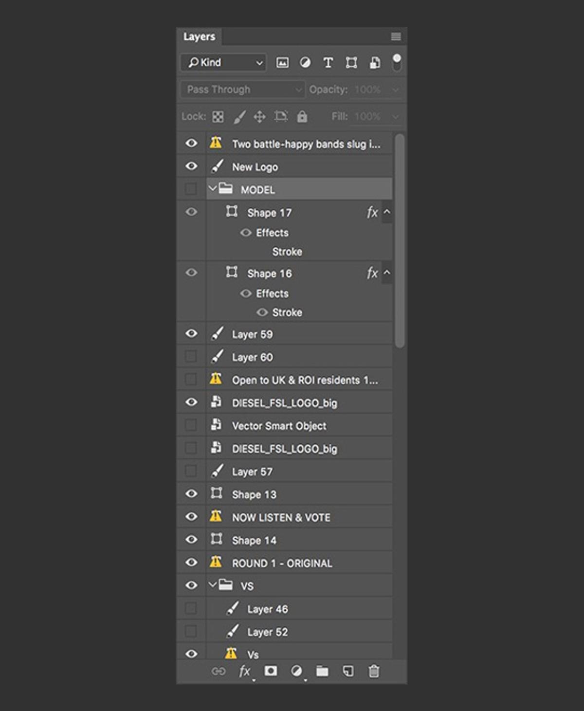
As a designer, it can sometimes be tough when you’re asked to make amends on a project that you haven’t worked on before. What makes it a real pain in the arse is when, after searching around for 3 hours on Dropbox to finally find a file named like the title of this blog post, you are swiftly greeted by a layers panel that looks like it was organised by a Golden Retriever in a tie.
It’s an easy hole to fall down and it used to happen at NEVERBLAND. It doesn’t anymore.
We went from having something like this:
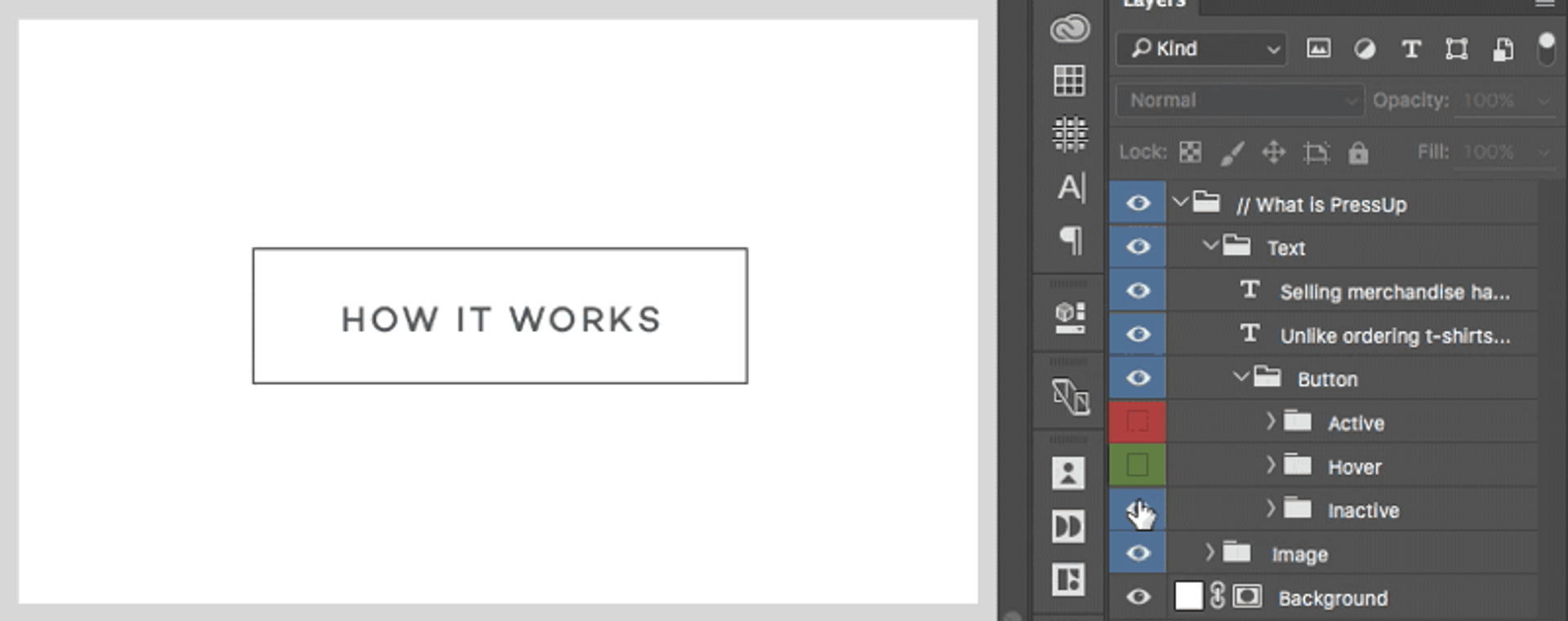
To something like this:
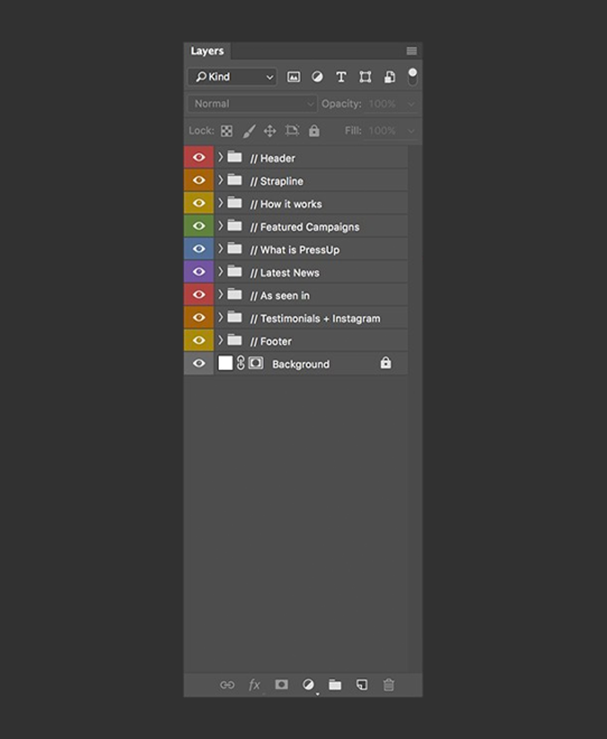
Pretty isn’t it! (We are designers after all)
Our design team often has to jump in and out of each others PSDs and Sketch files to make amends or grab some assets, which can take ages if our files aren’t neatly organised. So, we implemented some guidelines that mean that we all find it easy to collaborate, and are never surprised when opening up a file for the first time.
The examples I will show in this post are all from Photoshop, but a very similar process can be applied when working with Sketch or other design software.
The golden (retriever) rule of keeping your layers organised is to start strong. If you keep your layers neat from the second you create your file, you’ll be much more likely to keep it up throughout. As soon as you slip up, it’s easy to say “I’ll just sort it out later” and then forget about it completely.
So the first thing I like to do when starting a new design is to create the base structure of my page with rectangles, sort of like a basic wireframe. If we’ve already created wireframes, I’ll base this structure off those. The idea is to split my page up into the main content sections. I’ll then put each of those rectangles into into own folder and name it based on what content will be inside it.
This tactic doesn’t really work for everyone, it depends on how you like to design, however I find it really useful so that I don’t forget anything I need to include on the page.
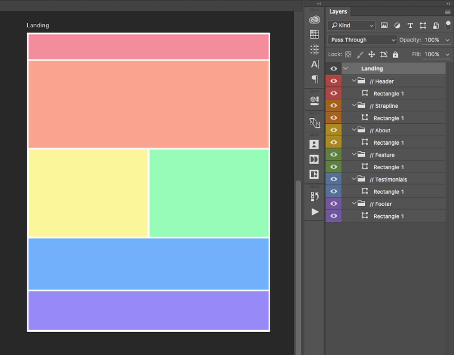
As you can see, each section is labeled with `//` prepended to distinguish them as top-level groups and then colour tagged. Some of our team even use emoji at the start of their groups so they’re super easy to see when scanning the list.
The colours are really useful when you have a large doc with lots of sub-folders as each of them will inherit the colour of their parent, so when you have lots of folders expanded, it’s super easy to know where you are at a quick glance.
Now that I have my base structure, I can start adding elements and building up my design. I personally find it easiest to add all the content that is required on the page before trying to add specific aesthetic styles or flourishes. So what you want to do is group all your layers that naturally fit together. For example, if I have a block with a heading, some description text and an image I will group them like so:
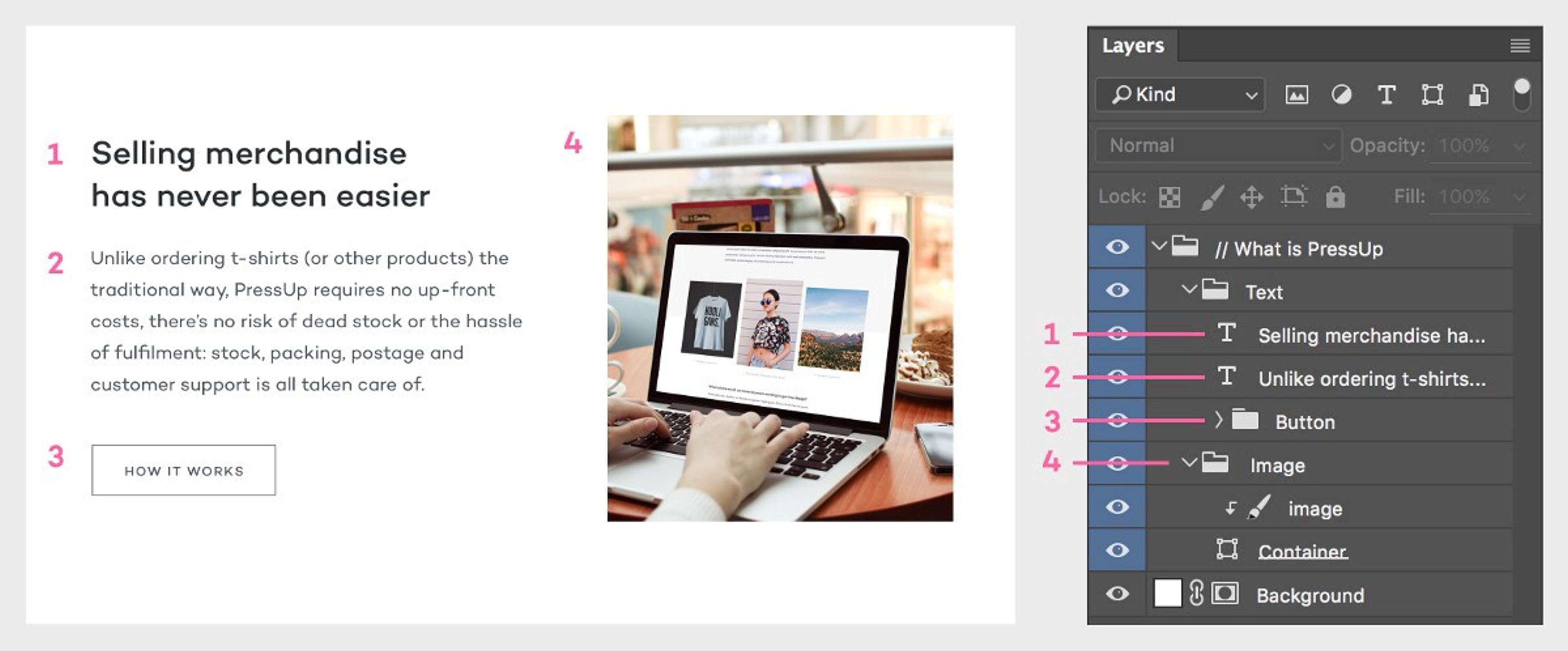
The order of my layers corresponds to my design as if I was “reading” the design like a book — left to right from the top down. That way it’s super easy to know which order your folders are in which helps you speed up navigating your doc.
What about hover effects or different states?
Easy, just group them up again and keep the different states in the same folder so they’re easy to toggle on and off.
I name the folders and change the tag colours to show they are an alternate state. When saving, I hide all states except for the standard inactive states so the design looks neat.
If you continue this process the whole time you’re working on your design, you’ll find that you actually save a lot of time in the end and your colleagues won’t hate you when they open something you’ve worked on.
Now it’s time to save this bad boy.
Better keep those file names nice and consistent otherwise how are people going to know what they’re working with or where to find it? When working with Sketch, this is simple because we keep versions on different pages within one file, however when using Photoshop we save out a new version each time major changes are made. This means we end up having lots of versions of the same file. Therefore when naming our PSDs we use a system like this:
So, for our folders we have a main design folder which then contains separate folders for each page. Inside the page folders live the folders for the different versions, and that’s where the actual design files sit. A new version is usually created when we send off the design to our partners to get feedback. If the feedback we get is significant, we then start a new version so we can track all our changes and revert back whenever needed.
When naming the actual file we first put the title of the page followed by an underscore, then the version number and then a letter. So for example: About_3C.psd
These letters are used to save out alternate options for the same version. Choosing when to create a new option is down to the discretion of the designer, but it’s often used when starting a new project and trying to define the style, so we usually end up creating a few different options.
That’s all for now. Any questions, suggestions for a digital product design studio like Neverbland or just want to share how you work, hit me up on twitter.
Related articles
The Thousand-Day Window
15 min read

The art of the digital detox
4 min read